Annota-tion- The article deals with the importance of colour among populations of several different countries around the world, choices of colour schemes in residential interiors of these countries, as well as common and distinctive features in colour schemes of interiors.
Methodology: The main methods of the study are the following: empirical, theoretical and empirical-theoretical. The empirical method includes observation, comparison, and generalisation. The theoretical method encompasses: progressing from the abstract to the concrete, abstraction, concretization, identification, and differentiation.
Induction is the process of deriving knowledge from facts to a specific hypothesis. Deduction is the process of deriving knowledge from general to particular and to consequences from premises.
Scientific Novelty: It has been found that the colour scheme of housing interiors in countries around the world depends on history, cultural traditions, geographical location and environmental features of different regions and reflects the national character and outlook of the people. Designers try to achieve harmony with the local nature and prefer natural colours as the primary colours. The accent colours are traditional colours for each country, which have a specific positive symbolic meaning.
Practical Significance: The peculiarities of colour in the interiors of residential premises in different countries, revealed as a result of the study, can help practicing designers design more perfect interiors in terms of colour and conscious use of traditional symbolic colours characteristic of certain regions.
## I. INTRODUCTION
One of the most critical problems in interior design is a professional, meaningful and reasonable use of colour that considers culture, psychology and colour preferences of different nations.
The use of colour in design plays a vital role in creating interiors, as colours affect mood, well-being and even worldview. Using specific colours and their combinations, designers have the opportunity to develop unique emotional impressions, influence the mental state of a person, emphasise on spatial elements, create a positive mood and a creative friendly atmosphere. A properly selected colour scheme in the interior of residential premises allows you to feel the peculiarities of national character and authenticity, which will help designers make interiors more informative, comfortable and unique.
## II. ANALYSIS OF PREVIOUS STUDIES
Gurney D.'s [6] research is dedicated to the relationship between colour and light. Gavin E. [5] studied the history of colour. Kuno N. [15] examined the combination of colours in practice.
Eisemann L. [2] studied the psychological features of colours, the influence of colours on emotions and their interaction. Pyle D. [16] examined the use of colour in interior design, developed practical tips for interiors of various functional purposes. Dodsworth S., Anderson S. [10] studied colour combinations in design and how colours affect the perception of space. Gill M., McCauley M., McCauley M., Kasabian A. [9] and Reagan SL, Poore D., [18] developed a practical approach to using colours in interior design to create a harmonious interior.
However, traditional symbolic meaning of colour in interior of different countries as well as common and distinctive features of modern interiors require further research.
## III. RESULTS AND DISCUSSION
The emotional and psychological impact of colour plays a significant role in our lives. Since the ancient times, prominent scientists and artists have been tried inventing a universal system of harmonious colour combinations in art, design, and architecture. As a result, a colour wheel and several schemes of harmonious colour combinations were developed (Fig. 1).
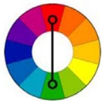
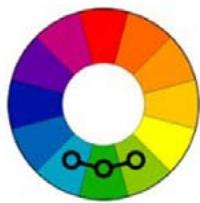
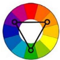
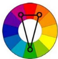
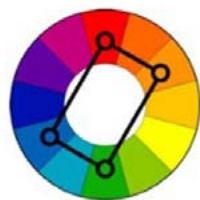
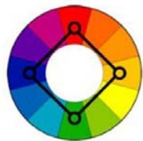 Fig. 1: Schemes of Harmonious Colour Combinations.
On the other hand, doctors and psychologists have studied the impact of colours on the physical and mental state of a person. Red excites, raises blood pressure, accelerates blood circulation, encourages active action and quickly tires.
Orange improves mood and increases appetite. Blue and green are calming. Yellow increases mental activity, promotes communication and intellectual activity.
So, it seems it is better to decorate kitchens and dining rooms in orange, bedrooms in blue and green, offices, living rooms and children's rooms in yellow.
But it is essential to keep in mind that the population of each country has its unique associations with specific colours. The same colour has completely different meanings in different countries. In Ukraine, Finland and Germany, red is associated with love and life-giving power; in China, it symbolises happiness, good luck a festive mood; in Japan, it scares away evil forces; in the interior, it is used together with white stripes to mark festive areas. In kabuki theatre, red stripes on the actors' faces represent justice, and blue stripes, on the contrary, represent crime.
In Ukraine, Finland and Germany, white is associated with purity, peace, joy and marriage, while in Japan it symbolises not only spiritual and physical purity, wisdom, but also grief and old age. In Buddhism, white means death. In Europe, black is the colour of the earth and sadness, in the Arab world it indicates a successful marriage, and in China it represents honesty.
For many Slavic peoples, yellow is considered the colour of betrayal, jealousy, in America it means frivolity, and in Japan, China and India, yellow is an extremely positive and noble colour and is associated with the Sun, wealth, and gold.
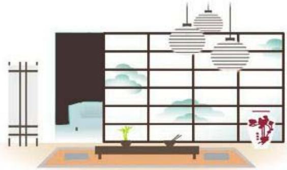
When choosing a colour scheme for their home interiors, the Japanese are limited to a monochrome colour scheme with one bright accent. The primary colours are grey or brown with different shades, featuring white or milk colours of geometric lattice screens, partitions and accent red (Fig. 2,3,5).
 Panel label: WHITE.

PANTONE 429C

PANTONE 439C

PANTONE 195C Fig. 2: The Colour Scheme of the Japanese Interior.
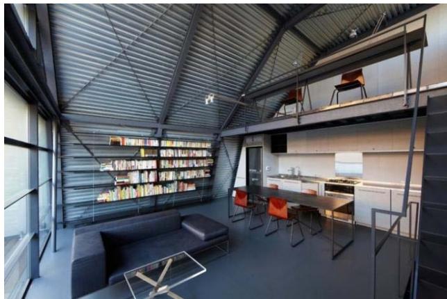
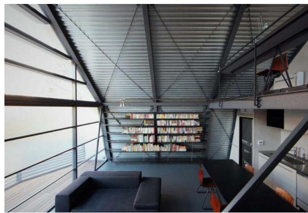
Fig. 3: Mishima House by Keiji Ashizawa Design (2010) Despite being located in the centre of Tokyo, the apartment provides privacy for the owners, as all private rooms are located on the closed lower floors, while the living room, library, and study are located on the third level and, although they have large panoramic windows, frosted glass protects the residents from excessive attention from the outside world. The severity and restraint of the interior is emphasised by the steel beams under the ceiling, dark grey colour scheme with red accents.
The characteristic features of Japanese interiors are minimalism, the use of natural materials, especially wood, restrained grey, white and brown colours (Fig. 4).
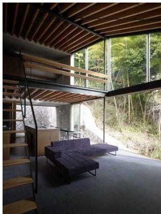
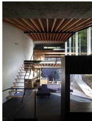
Fig. 4: Interior by Suppose Design (2009) in Kamakura.
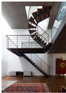

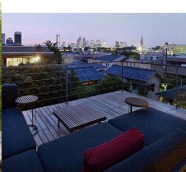
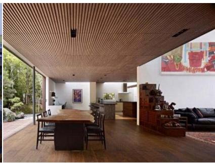 Fig. 5: House S. Keiji Ashizawa Design (2011) in Tokyo.
One of the most important features of Japanese residential interiors is unity with nature: panoramic windows, plastic natural forms (Fig. 6).
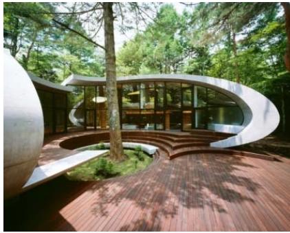
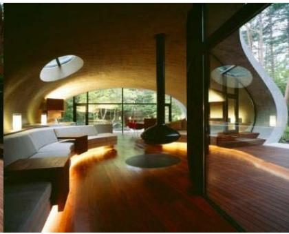
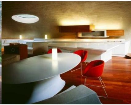 Fig. 6: Shell Villa by ARTechnic Architects (2008) A Shell-shaped Villa in the Middle of a Forest in Kitasako, Nagano.
The colour scheme of Finnish interiors reflects the cold, harsh climate (white and grey) on the one hand, and the warmth of wood with all shades of golden brown on the other. It is associated with the interiors of
Alvar Aalto, grey concrete and various shades of natural wood. The main colours are white, grey, brown with terracotta or green accents (Figures 7, 8, 9, 10).
 Panel label: WHITE.

PANTONE 7541C
PANTONE 5807C
PANTONE 499C

PANTONE PROCESS BLACK

PANTONE 350C
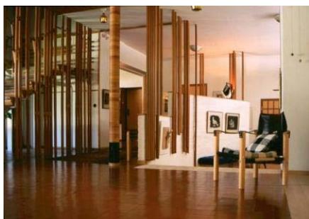
Fig. 7: The Colour Scheme of the Finnish Interior.
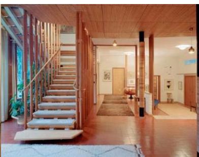
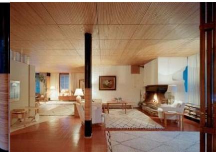
Fig. 8: Meyer's Villa (1939) by Alvar Aalto in Normarke.
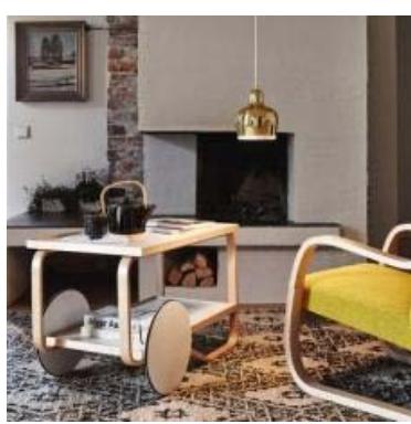
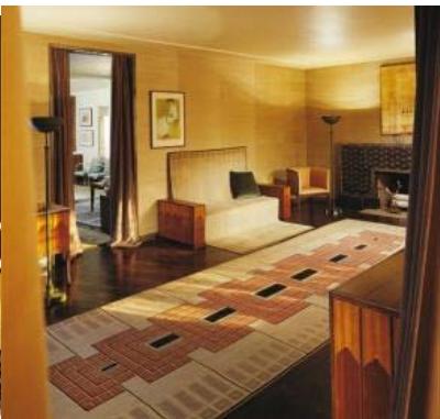
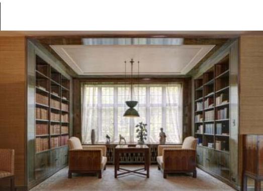
Fig. 9: ARTEK design. Saarinen House, Eliel Saarinen, 1930, Bloomfield Hills, Michigan, USA.

 Fig. 10: Modern Finnish Interior. Risto Musta & Johannes Romppanen. Suvi Sillvan, Tampere.
The German colour scheme is calm and restrained, often graphic, as an echo of the interior of half-timbered structures. These are milk, cream, olive, light coffee shades with brown and sometimes black elements (Fig. 11, 12, 13, 14).
To a certain extent, the colour scheme of German interiors reflects the national German character: restraint, severity, precision, rationality. There is nothing extra in the interiors, and everything is in its place.
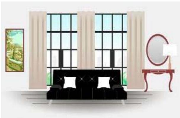
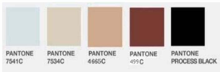
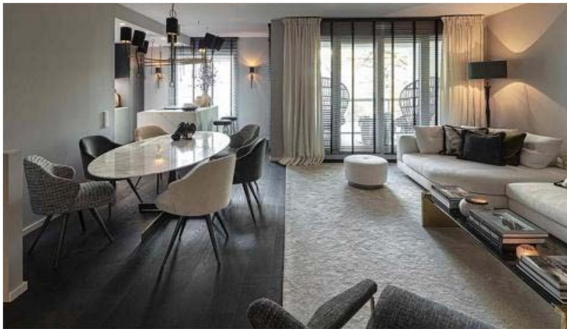
Fig. 11: The Colour Scheme of the German Interior.
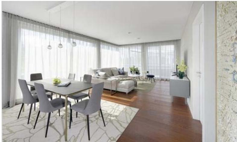
Fig. 12: Modern Interior Design by the German Studio Egetemeier Designs.
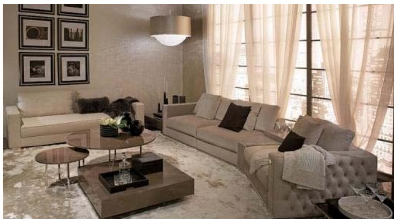 Fig. 13: Modern Interior Design by Jeanette Heerwagen Design Consulting, a German Studio.
Of course, the results of identifying the dominant colour scheme in the palette of different countries are pretty conditional and depend on many factors, one of which is the personal preferences of the designer and the customer, their temperament, their psychological characteristics. For example, the individual preferences and temperament of German designers David Rizzo and Peter Bachberg brought rather bright colour accents to traditionally achromatic modern German interiors: David Rizzo's is green, and Peter Bachberg's is yellow (Figures 15, 16).
Fig. 15: Coloured Green Accents by Davide Rizzo.
 Fig. 16: Yellow Accents by Peter Buchberge.
Ukrainian interiors are characterised by white walls and bright accents of textiles, carpets, pillows and other accessories with a dominant red colour. To create a Ukrainian ambiance, modern designers actively use ceramic tableware in yellow, red, brown and terracotta, along with paper cuttings, towels and pillows as accents (Fig. 17).
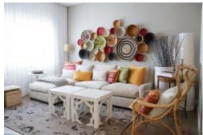
Fig. 14: Modern Interior Design by the German Studio Art und Ambiente.
 Panel label: WHITE.
 Panel label: PANTONE.

PANTONE CoolGray11C
PANTONE 810C
 Panel label: PANTONE.
10C

PANTONE 350C Fig. 17: The Colour Scheme of Ukrainian Interiors.
The meanings of colours in the Ukrainian tradition are based on house paintings, embroideries, and decorations:
1. White means purity, peace and the universe. Whitewashed walls in the house protect against diseases. Our ancestors believed that only young, unmarried girls could wear embroidered shirts with decorative white colour.
2. Red - love, fire, vital energy, joy. It is the most common colour in paintings, embroideries, and towels.
3. Black - prosperity. Since the land is the main breadwinner of our ancestors, they associated black with the land and its fertility. But not all regions of the country think so. For example, in Polissia, black is a symbol of grief and death, while in Podillia and the Borshchiv community, on the contrary, black embroidery on clothes, carpets and blankets promises wealth and prosperity to the owner.
4. Blue symbolises the sky and water (deliverance from illness and the colour of peace of mind). This
colour on blankets, walls, towels and embroideries was considered a powerful amulet.
5. Green is a feminine colour, associated with youth, beauty, nature and spring. It was believed that the presence of green in the house and embroidery protected from the natural elements. Green and yellow colours are especially characteristic of Hutsul interiors. In the past, Ukrainian houses painted stoves with green graphic patterns. A favourite motif was the tree of life.
6. Gold or yellow - this colour is a symbol of the sun and ripe wheat, prosperity, wealth, and joy. It was believed that dishes, blankets, and embroidered shirts with gold and yellow ornaments would help bring material prosperity to the house.
Contemporary designers actively use embroidered ornaments to decorate walls and furniture (Figure 18). For example, designer Yaroslav Galant has created a unique collection of furniture and accessories that proves how much people are interested in Ukrainian motifs.
 Fig. 18: Traditional colours of Ukrainian interiors.
## IV. CONCLUSION
Colour in residential interiors around the world reflects environment, national character and even worldview. Despite the diverse colour schemes used in the interiors of different countries, the emphasis is put on harmony with local nature. Designers prefer natural colours. Various shades of white, ocher, brown, grey and olive are chosen as the primary colours in the decoration of living spaces, and the accent colours are traditional for each country, which carry a specific positive symbolic meaning.
Generating HTML Viewer...
References
20 Cites in Article
Sh Adams (2017). Slovnyk koloru dlia dyzaineriv [Color dictionary for designers.
L Eiseman (2007). Kolir, povidomlennia ta znachennia: kolorovyi resurs.
D Albers (2016). Josef Albers. Interaction of Color.
A Wax (2007). Kolirni skhemy Cant Fail: posibnyk iz koloriv dlia inter'ieru ta ekster'ieru vashoho domu v m'iakii paliturtsi.
E Hevin (2019). Istoriia koloru. Yak farby zminyly nash svit [History of color.
A Strizhakov,V Belousova,E Timokhina,I Bogomazova,E Pitskhelauri,A Podtetenev,E Kuznetsova,Yu. Yu.I.Tolkach (2016). Perinatal outcomes in premature birth.
B Hess (2009). Abstraktnyi ekspresionizm.
T Guild (2017). Korobka farb Tricia Guild: 45 palitr dlia vyboru kolirnoi tekstury ta maliunka.
M Gill,M Mccauley,M Mccanley,A Kasabian (2002). Rozfarbuite svii dim u krasu: idei ta rishennia [Color Your Home Beautiful: Ideas and Solutions.
Simon Dodsworth,Stephen Anderson (2015). The Fundamentals of Interior Design.
J Itten (2022). Mystetstvo koloru [Art of color.
D Kaufman,T Dahl,C Pittel (1999). Kolir i svitlo: svitli atmosfery dlia pofarbovanykh kimnat [Color and Light: Luminous Atmospheres for Painted Rooms.
T Konran (2018). Pro kolir.
Zh Koss (2018). Kolir. Chetvertyi vymir [Color. The fourth dimension.
I Mosse,N Sedlyar,K Mosse,E Yanchuk,T Dokukina,O Glebko,V Shadenko,A Vankovich (2020). GENES OF THE BRAIN NEUROTRANSMITTER SYSTEMS DETERMINING THE HUMAN PSYCHOEMOTIONAL STATUS.
J Pile (1997). Kolir v dyzaini interieru [Color in Interior Design.
M Portillo (2010). Kolorove planuvannia dlia inter'ieriv: intehrovanyi pidkhid do koloru v sproektovanykh prostorakh.
S Ragan,J Poore (1995). Kolir inter'ieru za dyzainom: instrument dyzainu dlia arkhitektoriv, dyzaineriv inter'ieru ta domovlasnykiv [Interior Color by Design: A Design Tool for Architects, Interior Designers, and Homeowners.
K Sen-Kler (2022). Potaiemne zhyttia barv [The secret life of colors.
No ethics committee approval was required for this article type.
Data Availability
Not applicable for this article.
How to Cite This Article
Sidorova Olena Ihorivna. 2026. \u201cAnalysis of the Color Scheme of Residential Premises\u201d. Global Journal of Human-Social Science - A: Arts & Humanities GJHSS-A Volume 24 (GJHSS Volume 24 Issue A4): .
Explore published articles in an immersive Augmented Reality environment. Our platform converts research papers into interactive 3D books, allowing readers to view and interact with content using AR and VR compatible devices.
Your published article is automatically converted into a realistic 3D book. Flip through pages and read research papers in a more engaging and interactive format.
Our website is actively being updated, and changes may occur frequently. Please clear your browser cache if needed. For feedback or error reporting, please email [email protected]
Thank you for connecting with us. We will respond to you shortly.