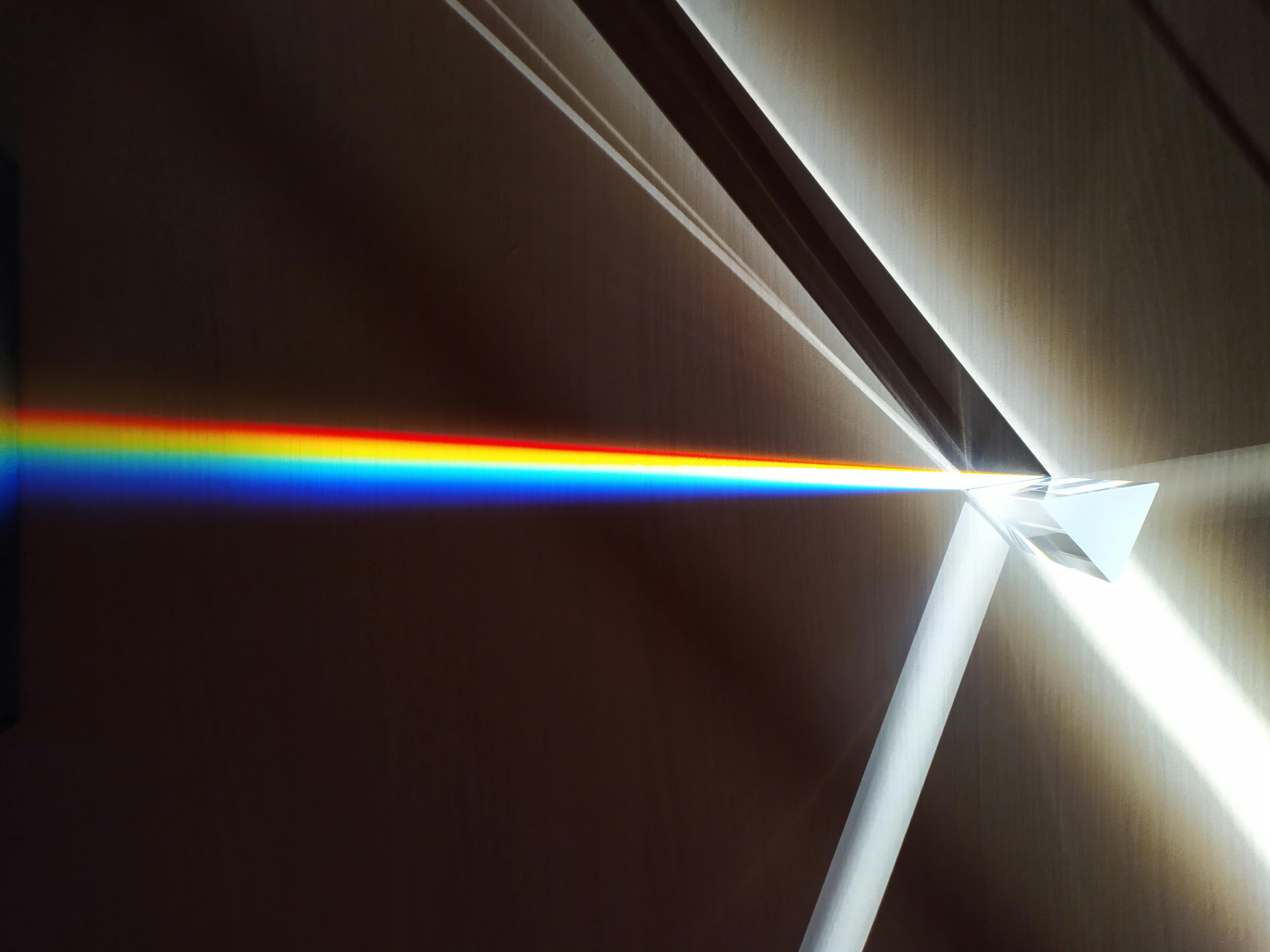
Colors are a world of magic and beauty, and a dazzling luster that gives things beauty and splendor. Colors play an important role in our lives, as they cause us joy and adornment, and without colors, life becomes bleak and boring. Colors affect human souls, their tendencies, desires, preparations, psychological and physical state, and these effects reach the depths of the human psyche, and are divided into positive effects that express comfort, love and joy, and negative effects that arouse feelings of anxiety, turmoil and sadness in our souls. Thus, the aim of the study is to provide a design which helps changing the internal environment of the places with the respect of the occupant’s moods.
## I. INTRODUCTION
Throughout the ages, color has played (and still does) an important and major role in people's lives, its importance is linked to customs, rituals, ceremonies, and even psychotherapy. The world of colors is a world full of subtleties, great secrets, colors everywhere a person moves in homes, clothes, streets, food, newspapers, movies, etc. Everything colored affects and influences human taste. After many researches and studies both psychologists and Philosophers have come to a clear definition of colors and mood. Color is a feeling that the eye reflects to us as a result of the analysis of white light. It is an attribute and effect produced by the retina of the eye, so it performs a three-color analysis for those who have seen it, whether it is pigmented or optical color. Meanwhile, Mood, a term in psychology that defines a person's emotional state, which may be negative or positive besides, The human mood is variable according to what is translated by the mind, and the mind derives this from the eye and what it has seen from the colors in the surrounding environment[1].
Furthermore, the general mood of a person is directly related to colors according to the effect of each color. colors have a main role in giving the feelings of spaciousness, distress, sadness, joy, and so on. Many studies and researches have been conducted on the effect of color on the general mood of the person, which showed a far-reaching effect of color on the person psychologically and organically. Color has an effect on the body, soul, and mood. The color elevates the soul and nourishes the nerves, relaxes the feeling, and has a clear effect on our daily life[2]. Consequently, Colors are aworld we interact with and affect our behavior and our psychological state.
On the other hand, Interior design has dealt with colors with the knowledge of their psychological effects and the dimensions of their use on space as a tool in the hands of the designers, enabling them to control the place and design it to serve the type of job and activity. For instance, the use of vibrantcolors in the living room due to the diversity of family activities in it, in contrast to the use of calm colors that help to relax for a bedroom. Moreover, the importance of colors has affected in dealing with the disadvantages of thedimensions of the space. For example, the small area of a particular room or the severity of the decrease or height of the ceiling according to the actual need of the place. Colors are one of the most important factors that affect thespace and the occupants.
## II. COLORS AND NATURE
Nature abounds in joyful colors, which give things their meaning, and these colors are at the top of harmony, they are classified as the most beautiful and charming colors, such as the blue is for the sky and the seas, the green for the trees, the yellow for the sun. In addition to the beautiful bright colors of plants, flowers, birds, and the color variation in stones above and below ground. However, as for the change in the color gamut throughout the day, which affects the mood of people in general, from the feeling of activity and movement in the morning to the decline and tranquility at night. Aristotle has discovered this color diversity in nature by tracking sunlight throughout the day a number of basic colors and placing them in a linear system, starting with white - that is, sunlight at noon - then yellow followed by red - with sunset - then violet and green - after sunset - then blue The blackness after the night falls.
## III. THE PSYCHOLOGICAL EFFECTS OF COLOR
As for the psychological effects of color, colors affect the soul, causing sensations that result in vibrations, some demonstrate thoughts of comfort and reassurance, and others that lead to disturbance from them, and the psychological effects of color lead to the effect on the size of the apparent inner space due to deception of sight With regard to surfaces and volumes. In addition, studies have proved that cold colors, especially the light blue value, has shown the inner space as Wider and larger than its true size. in contrast to the hot colors, they have given a feeling of the small size of the internal space and the short distance between the beholder (Recipient) and surfaces, and thiseffect can be taken advantage of the deceiving eyes and resulting in an apparent enlargement or reduction of the dimensions inside the space. Nevertheless, it is difficult to choose a color scheme that all people like, due to the difference in moods and feelings [3]. As well as the concern for colors is a healthy phenomenon, and people who love and continue to coordinate colors in their home, office,
and life surroundings in general, are people without a doubt that carry a lot of attention to Culture and regulation. The table below shows the different meanings of colors
Table 4.1: The meaning of colors.[4][5]
<table><tr><td>Red</td><td>Demonstrate courage, strength, warmth, energy, and survival instinct. Also, it Helps get rid of lethargy, laziness and the constant feeling of fatigue and stress</td></tr><tr><td>Yellow</td><td>Yellow color is associated with sunlight, as it increases feelings of joy, thought and happiness, and it also raises the spirit of joy, stimulates the brain and strengthens the mind</td></tr><tr><td>Blue</td><td>Demonstrate confidence, competence, reassurance, duty, wisdom, contemplation, calmness, and a sense of strength and psychological and moral stability</td></tr><tr><td>Orange</td><td>Orange and yellow are very much involved in their temperament on the individual, as orange stimulates mental activity and introduces a feeling of enthusiasm on the individual, as well as creativity and happiness.</td></tr><tr><td>Green</td><td>It is considered the color of life as it is one of the most calming colors and brings hope to the individual, as it is always associated with wide places, greenery and plants.</td></tr><tr><td>White</td><td>Has a strong influence in introducing feelings of calm, peace, and reassurance, safety and happiness. Also, it demonstrates health, cleanliness, clarity, purity, simplicity, and efficiency</td></tr><tr><td>Purple</td><td>Demonstrate Spiritual sublimity, inclusion, luxury, authenticity, honesty, and quality.</td></tr><tr><td>Pink</td><td>It gives feelings of Tranquility and peace of mind, care, warmth, femininity, love,</td></tr><tr><td>Black</td><td>It gives a feeling of prestige, dread and awe</td></tr><tr><td>Brown</td><td>Demonstrate Seriousness, warmth, proximity to the earth and nature, reliability, support.</td></tr></table>
## IV. COLORS TEMPERATURE
The color temperature of the light source is the temperature of the ideal emitter of a black body that emits a light that matches the color of the light source. Color temperature is a characteristic of visible light that has important applications in lighting, photography and video, publishing, manufacturing, astrophysics, horticulture, and other fields. In practice, color temperature is meaningful only for light sources that actually somewhat correspond to some blackbody radiation. Color temperature is usually expressed in Kelvin, using the symbol K, a unit of measurement for absolute temperature. When referring to color temperature, Kelvin (K) indicates warmth or coolness in a light source. It is a unit of measurement used to describe the color of a tint or the color of a given light source such as a lamp or the sun [9].
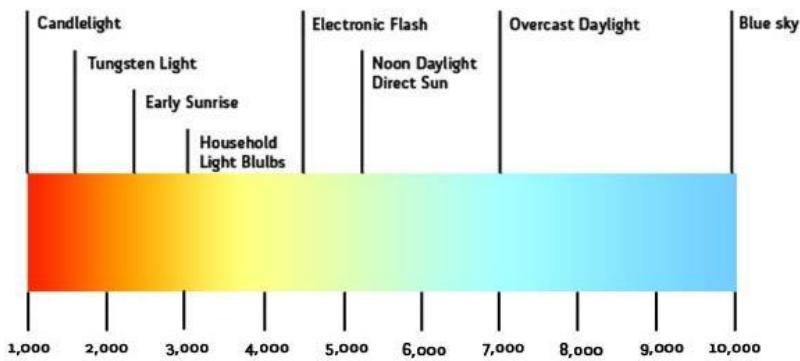 Kelvin Color Temperature Scale Fig. 6.1: Kelvin colors temperature scale.[12]
The color range used in the lighting industry extends from 8,000 Kelvin or 8,000K to 2,000K with 5,000K being the most common. On this scale, the higher the kelvin source value of the light source, the light appears distinctly "colder" and has a color temperature closer to actual sunlight. "Cold" light has a white or blue hue and a color temperature between 4,100K and 6,500K, which is on the higher end of the kelvin scale and includes actual sunlight. Anything that falls above this range will emit light deeper shades of blue and can exceed the color temperature of sunlight. Additionally, Lights in this range also have shorter wavelengths and are ideal for use in commercial or industrial environments such as parking garages, warehouses, gyms, sports stadiums, outdoor pole lighting, and gas stations. Types of lighting used in these environments include fluorescent, LED, or induction lighting with a color temperature of 5,000K or higher, which has the same or higher color temperature as the sun's temperature. Lights located in the middle of the Kelvin scale, between 3,500K and 4,100K, will have a more neutral white that resembles a midday light. These lights have mid-range wavelengths and are ideal for use in offices and retail stores. Nevertheless, the "warm" light has anamber, reddish, orange, or soft white to yellow hue and a color temperature of 2,000K to 3,000K, which lies on the lower end of the kelvin scale. This type of light uses longer wavelengths and lamps in this range are commonly used in bathrooms and kitchens [10].
## V. COLORS IN INTERIOR DESIGN
Color is one of the visual elements which has a great importance due to the energy it carries with a visual content affecting the sensory and mental perception through which a sense of the beauty of the
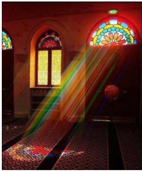 Fig. 7.1: Colorful glass window (qamaria) in the Yemeni buildings interior design and the integration of its performance, functional and expressive elements is a characteristic of all surfaces. Modern studies of color have greatly influenced interior design, so the color is no longer in the same traditional concept as a layer of paint or a material for decoration and means of entertainment, but rather color has become one of the material's characteristics and is inseparable from it. Moreover, Color is a physical phenomenon, and its main sources are light and visuals in nature, and it is characterized by three main factors that are interconnected between them. A) Color trait: as it represents the basic colors that are mixed in different proportions giving all other colors. B) Colorvalue: It is the optical value of a color in relation to the extent of its whitenessor darkness, and that is through the degree of reflection of the incident light. C) Color intensity: the degree of purity and concentration of the color characteristic that extends from neutral gray to pure white. However, these factors can be changed by using pigments or by the effect of light falling on them. And far from its visible aspects, color can affect the design elements, their proportions and their relationship. Consequently, the interior design of the spaces requires taking into account the visual effects of color represented by: a) The influences of the form that take into account the aspects related to aesthetics.
b) Psychological effects related to aspects of the effects of color onthe human psyche [11]. Table (7.1) shows the analysis of colors.Furthermore, the use of the diversity of colors within the interior spaces is anancient process, as the ancient architects, technicians and craftsmen in different countries were keen to add colors within their buildings in a way that allows for the color diversity and transformation during the day, which depends on natural lighting.
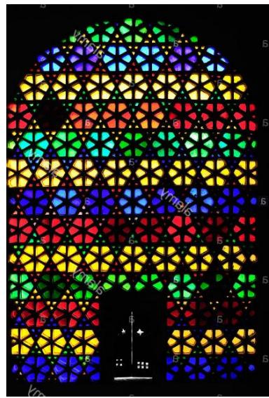 Fig. 7.2: Colorful stained-glass window in the city palace of Udaipur Rajasthan, India, Asia
Table 7.1: The analysis of colors.
<table><tr><td>Color</td><td>Category</td><td>Temperature Range(K)</td><td>General Meaning</td><td>Mental Perception of Color</td><td>Perception of Color</td></tr><tr><td>Red</td><td>Warm color</td><td>1500-2200</td><td>Bright and attractive, strong and dark</td><td>Hot, fire, heat, blood and danger</td><td>Enthusiasm, pleasure, activity and Intensity</td></tr><tr><td>Yellow</td><td>Warm color</td><td>2700-3200</td><td>Radiant, bright and glowing</td><td>Sunlight, day time and caution</td><td>Happiness, inspiration, vitality and health</td></tr><tr><td>Blue</td><td>Cold color</td><td>5500-8000</td><td>Transparent and moisturized</td><td>Cold, sky, water and snow</td><td>Meditation, wisdom, calm and serenity</td></tr><tr><td>Orange</td><td>Warm color</td><td>2200-2700</td><td>Bright, luminous, glowing</td><td>Heat and warmth</td><td>Fun, vigor and strength</td></tr><tr><td>Green</td><td>Cold color</td><td>5000</td><td>Clear and moist</td><td>Coolness, nature and purity</td><td>Calm, peace and asense of freshness</td></tr><tr><td>Purple</td><td>Cold color</td><td>5500-8000</td><td>Dark and soft</td><td>Cool and shadow</td><td>Grandeur, luxury and sadness</td></tr><tr><td>White</td><td>Neutral color</td><td>4000-4200</td><td>Space and light</td><td>Cold snow and cleanliness</td><td>Purity, cleanliness, nature and brightness of the soul</td></tr><tr><td>Black</td><td>Neutral color</td><td></td><td>Space and darkness</td><td>Neutral, night, emptiness, mourning</td><td>Majesty, gloomy, denial, loneliness</td></tr></table>
### Interactive Tiles
The lighting color temperatures greatly affects the psychological and physical state of a person and changes his mood as well as it works to provide beauty in the internal design of spaces and make them look attractive and distinctive. Consequently, the proposal aims to provide interactive can be changed with the human mood. In addition to taking into account what is commensurate with the needs of the space in terms of size or location, whether in the walls, ceiling or floor. Besides, The ability to control the levels of tiles, which allows the colored shadows to be reflected on the internalspace.
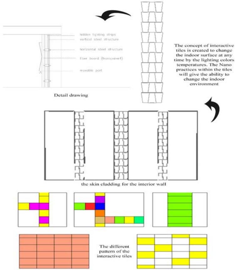 Fig. 5.13: Interactive tiles design analysis.
Table 5.4: Interactive tiles analysis.
<table><tr><td>Ecology</td><td>Using fiber material, which is sustainable. Connecting the light with solar energy.</td></tr><tr><td>Sensation</td><td>Relaxation for the sight and refresh the brain and nerves.</td></tr><tr><td>Social</td><td>Having a strong connection between the occupant and interior environment by changing the lighting colors depending on their mood.</td></tr><tr><td>Physio</td><td>Soft touch of the fiber surface and calm effecting of the light.</td></tr><tr><td>Psycho</td><td>Change the psychological and physical state; generate positive energy.</td></tr><tr><td>Ideo</td><td>Facilitate the idea of rehanging the design of the place. Low cost material.</td></tr></table>
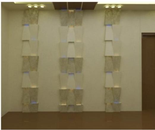
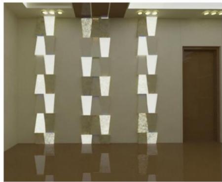
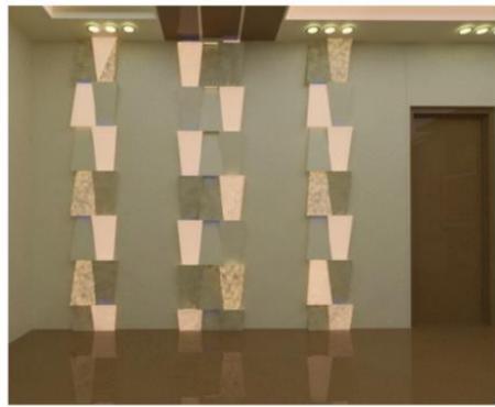
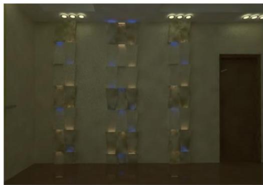
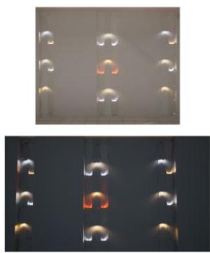 Fig. 5.14: Interactive tiles design views.
## VI. CONCLUSION
If all the factors above are considered, the main conclusion that can be drawn is that Color is an essential component of our world, not only in the natural environment but also in the architectural environment. Its usefulness lies in the fact that it helps people communicate with themselves and their energy and qualifies them to respond to all the things around them and their feelings as well. Therefore, it is important to provide a comfortable and colorful internal environment that assists a person change his mood through the use
of modern technology that provides attractive and beautiful designs in addition to facilitating the requirements and needs of individual. Not only dose color consider as a significant element that affects the formation of spaces, but it also impacts the human psyche and body through the different vibrations of colors which work directly with the human energy.
Generating HTML Viewer...
References
11 Cites in Article
L Eiseman,R Hickey (1998). Colors for your every mood: Discover your true decorating colors.
Alexander Soldat,Robert Sinclair (2001). Colors, Smiles, and Frowns: External Affective Cues can Directly Affect Responses to Persuasive Communications in a Mood-like Manner Without Affecting Mood.
Domicele Jonauskaite,Betty Althaus,Nele Dael,Elise Dan‐glauser,Christine Mohr (2019). What color do you feel? Color choices are driven by mood.
D Murray,H Deabler (1957). Colors and mood-tones.
Tina Sutton,Jeanette Altarriba (2016). Color associations to emotion and emotion-laden words: A collection of norms for stimulus construction and selection.
Zena O'connor (2011). Colour psychology and colour therapy: Caveat emptor.
Mcleod (2012). Colours of the soul: transform your life through colour therapy.
Ilse Truter (2006). Colour therapy:" Using the energy of light in controlled 'doses' to affect healing": complementary and alternative medicine.
P Boyce,C Cuttle (1990). Effect of correlated colour temperature on the perception of interiors and colour discrimination performance.
Gerrit Rutgers,J De Vos (1954). Relation between brightness, temperature, true temperature and colour temperature of tungsten. Luminance of tungsten.
Kemal Yildirim,M Hidayetoglu,Aysen Capanoglu (2011). Effects of Interior Colors on Mood and Preference: Comparisons of Two Living Rooms.
Explore published articles in an immersive Augmented Reality environment. Our platform converts research papers into interactive 3D books, allowing readers to view and interact with content using AR and VR compatible devices.
Your published article is automatically converted into a realistic 3D book. Flip through pages and read research papers in a more engaging and interactive format.
Our website is actively being updated, and changes may occur frequently. Please clear your browser cache if needed. For feedback or error reporting, please email [email protected]
Thank you for connecting with us. We will respond to you shortly.