The R-Verdict Schema, a UI design model based on the principles of Relevance and Relation of UI elements and components to interaction concepts has gained recognition for its simple and decisive approach to interface design. While its theoretical framework has been well received, its practical use impact on designers remains unexplored. This study investigates how a team of novice designers apply the R-Verdict Schema in real design tasks, evaluating its effectiveness in enhancing usability, consistency, and decision-making. Through controlled experiments and qualitative feedback, we assess how the model aids novice designers in structuring interfaces, improving element relationships, and fostering intuitive interactions. The findings reveal that the schema significantly supports beginners in developing cohesive UI layouts and making design choices that align with user expectations. This research contributes to UI/UX education by demonstrating the schema’s potential as a guiding framework for early-stage designers, ultimately reinforcing the value of structured design methodologies in digital interface development.
## I. INTRODUCTION
Usability evaluation is a critical component in assessing the effectiveness of design models, particularly in the rapidly evolving field of user interface (UI) design (Allen & Sites, 2012). As UI complexity continues to increase, frameworks that assist designers in structuring and refining interfaces become essential. The R-Verdict Schema, a recently developed UI design model, offers a structured approach based on principles of relevance to interaction concepts and the relational behaviour of UI elements (Ahiaklo-Kuz & Rotting). While initial reception of the model has been positive, a systematic evaluation is necessary to determine its practical usability, especially among novice designers.
According to Ahiaklo-Kuz & Rötting (2024), The R-Verdict Schema aims to bridge the gap between complex design principles and practical application by offering a structured methodology tailored to novice designers. However, for the model to be widely adopted, it must demonstrate its usability through empirical evaluation. Evaluation is an integral part of every instructional design process, essential for establishing the viability and reliability of development models (Calhoun et al., 2021). The Successive Approximation Model (SAM) was employed in the development of the R-Verdict Schema, entailing a series of iterative formative tests to refine the model before its final release (Elharbaoui et al., 2025). Additionally, a summative usability test (Prince, 2015) was conducted on the final model, which is detailed in this paper. Both formative and summative approaches offer distinct benefits and challenges in the evaluation process.
The primary objective of this study is to assess the usability of the R-Verdict Schema through empirical user testing. By examining factors such as ease of learning, efficacy, error rates, and perceived usability, this research aims to determine whether the schema enhances the design process for novice UI designers. The study employs a mixed-methods approach, integrating both quantitative and qualitative data to gain a comprehensive understanding of the model's effectiveness. To achieve these objectives, task-based usability testing was utilized to measure how efficiently novice designers can complete UI design tasks or evaluate UIs using the schema. This approach provides insights into the practical application of the R-Verdict Schema in real-world design scenarios.
By systematically evaluating the R-Verdict Schema, this study contributes to the broader field of UI design methodology, offering insights into how this structured design model impacts novice designers' effectiveness. The findings will help refine the schema, ensuring that it meets the needs of its intended users while advancing best practices in UI design. Ultimately, this research aims to validate whether the R-Verdict Schema is a viable and user-friendly model that can facilitate more intuitive and effective UI design processes.
This paper primarily details a usability test and its outcome on mainly novices (non-professional UI designers). The study engaged 5 participants in a qualitative study over a period of 2 hours, focusing on three main tasks: Introduction to the model and its use case; Application of the model in planning and self- evaluating a UI; Applying the model in planning and making UI wireframes, followed by peer-reviewing the wireframes using the R-verdict schema. These tasks were designed to ascertain participants' ease of use of the R-verdict schema, helping to understand their perception of usability, clarity of concept, and the schema's effectiveness in guiding them towards achieving minimalistic and intuitive designs.
## II. METHODOLOGY
This experiment is qualitative in nature as it deals with exploring and evaluating participants' subjective understanding of a subject and analysis of work samples shared in the course of the engagement. Convenience sampling was used in getting participants to participate in the study (Simkus, 2022; Etikan et al., 2016; Dornyei, 2007). The evaluation process is as outlined:
### a) Pre and Post Experiment Surveys
With ethical consideration in place (participant consent and agreements and privacy considerations), the study issued pre-study survey to accrue participant biographic information and post experiment survey to ascertain their perception on the model and its usage. The pre-experiment survey solicited the following information from the participants.
1. Pre experiment: Age, Gender, Language preference, highest level of education, current profession, technology proficiency, familiarity with UI design.
2. Post experiment: Identification (internal use only), Opinion on model, understanding of model, application of model, overall satisfaction.
## III. EXPERIMENT OUTLINE
### a) Part 1
1. Introduction of Participants to the R-Verdict Schema with focus group discussion on planning a simple UI (Duration: 15 minutes).
2. Choose and plan a simple UI design task (Duration: 5 minutes).
- To do list App
- Music Player
- Grocery list app
All design tasks came with a design brief and definition of target audience to limit the scope of design as much as possible. UI components sample sheets were also provided to guide participants.
3. Participants generate simple wireframe of their plan (Duration: 25 minutes).
b) Part 2
Participant conduct peer-review of wireframes generated by other participants in Part 1 (15 minutes). The entire session run for 1 hours.
## IV. FINDINGS AND DISCUSSIONS
The demographic and experiential profile of the study participants provides valuable context for interpreting the research outcomes. The sample consisted predominantly of young adults, with $80\%$ $(n = 4)$ falling within the 25-34 age bracket and $20\%$ $(n = 1)$ in the 18-24 range. This age distribution aligns with the typical demographic of early career professionals and advanced students who are likely to engage with UI design tasks (Nielsen, 2013). Gender distribution showed a predominance of female participants $(80\%, n = 4)$, which may offer insights into potential gender-specific perspectives in UI design interpretation (Burnett et al., 2016).
All participants reported daily internet usage, primarily via laptops and smartphones, indicating a high level of technological engagement consistent with current trends in digital device usage (Pew Research Center, 2021). The participants' familiarity with UI design varied, with the majority $(60\%, n = 3)$ reporting moderate familiarity. This diversity in UI design experience allows for a range of perspectives, from novice to more experienced users, which is crucial for comprehensive usability testing (Sova & Nielsen, 2003). This comprehensive participant profile and initial engagement provide a solid foundation for the subsequent detailed analysis of the R- verdict schema's effectiveness in UI evaluation and design. The study incorporated both in-person and remote participation, utilizing digital design tools such as Miro board. This approach aligns with contemporary practices in user research, allowing for flexibility and broader participant inclusion (Lazar, Feng, & Hochheiser, 2017).
The introductory session, lasting approximately 15 minutes, served to establish a baseline understanding of UI concepts among participants. This approach is consistent with best practices in usability testing, ensuring participants have a common foundation before engaging with the test material (Rubin & Chisnell, 2008). Participants' initial discussions about UI experiences revealed a common understanding of UI encounters in daily life, mentioning platforms such as Spotify, X (formerly Twitter), banking apps, and various Microsoft products. These observations align with current trends in digital product usage and highlight the ubiquity of UI interactions in modern life (Statista, 2023). Notably, participants emphasized key UI qualities such as speed and intuitiveness, echoing established principles in UI design literature (Norman, 2013). The recognition of the importance of distinguishing between good and bad interfaces demonstrates an awareness of UI quality variability, a critical aspect in user-centered design (Shneiderman et al., 2016).
This comprehensive participant profile and initial engagement provide a solid foundation for the subsequent detailed analysis of the R- verdict schema's effectiveness in UI evaluation and design.
After introducing the participants, the R- verdict schema, the team engaged in a focus group discussion on listing and analysing components needed for collectively agreed interface (Elevator control panel). Table 1.1 shows the summary of the outcome.
Table 1.1: Review result from focus group discussion
<table><tr><td>Suggested Component (Participants)</td><td>Group decision (based on R-verdict schema)</td></tr><tr><td>Floor buttons</td><td>It is relevant to user and to the task of selecting and getting to floors. It also relates to the basic task/function of the elevator. (+Relevance, +Relation)</td></tr><tr><td>Emergency Button (To call for help in case of crisis.)</td><td>It is not relevant to the user and task in the performance of the basic task but in emergency situation it is relevant to get support. (+Relevance, -Relation)</td></tr><tr><td>Lighting Switch and Brightness control: This feature allows users to turn on light when its dark and also adjust the light brightness</td><td>Lighting is relevant to the environment in case the user uses the elevator at night. The brightness control feature is not necessary. An automated lighting with ambient and presence senor can work out with users controlling it. (+Relevant, -Relation)</td></tr><tr><td>User manual: To give users information on how to operate the elevator</td><td>It is relevant for first-time users, but does not apply predominantly in the general use of the elevator. (+Relevant, -Relation)</td></tr><tr><td>Open and close buttons: For users to be able to personally close and open the elevator</td><td>Feature is not necessary if the doors open and close automatically. But it can be there in case the automatic system fails. (+Relevance, +Relation)</td></tr><tr><td>Reset button - use to restore elevator configuration to default in case of a jam.</td><td>That does not relevant to end-users. It is also not relevant to end task but Technicians will need. It is relevant in case of troubleshooting but does not relate in the to the task of basic interaction to reach a floor. (+Relevance, -Relation)</td></tr><tr><td>Sportify Connection: With QR Code users can easily connect an account and listen to their preferred music</td><td>It is not relevant to the basic task of using an elevator must be removed. (-Relevance, -Relation)</td></tr><tr><td>Feature to connect and control Elevator from one's phone: User can have preferred configuration loaded to their phones which should connect and determine their target floor. There could additionally be authentication via phone before user uses the elevator</td><td>This feature is just unnecessary burdensome as compared to simply pressing buttons. It is not relevant to the task, user and environment because the time spent in the elevator is very short and most often used by many people. Additionally, authentication would have been good in a security facility, but the problem description does not state it. So that assumption will be unnecessary. (-Relevance, -Relation)</td></tr><tr><td>Language Selector: For users to be able to change operation and instructional language of the elevator</td><td>This feature is good and relevant in a place where users come from mixed backgrounds (language). It however does apply to the basic task and since the task is basically about selecting numbers, numeric symbols are already universal across languages (+-Relevance, -Relation)</td></tr><tr><td>Elevator status display: This feature is to indicate to user the current floor or action the elevator is doing.</td><td>If there is no way to inform the users on which floor the elevator is then it is important to keep it. (+Relevance, +Relation)</td></tr></table>
Obviously much of the ideas and analytical inputs into applying the principles come from a recall of participants interaction with similar interfaces. This is however not in contrast to the application of the R- verdict scheme as relying on previous knowledge in designing interface is key to promoting easy recall. The R-verdict schema was more helpful in refining design decisions towards a more simplified concept.
## V. WIREFRAME COMPONENT PLANNING AND EVALUATION
All participants completed the second experimental task, which required selecting a design challenge and planning their own interface components. Most participants completed this task in person, with one exception who participated online and shared their plan sheet digitally for peer evaluation. In this schema, the first symbol in the notation $(+ / -)$ indicates relevance to user needs, while the second symbol indicates verdict on the relation principle to overall system functionality, creating four $(2^{n}; n =$ number of principles) possible verdicts: $+, +$ (highly suitable), $+, -$ (relevant but poorly related), $-, +$ (less relevant but well-related), and $-, -$ (unsuitable).
### a) To-Do List Application Component Evaluation Summary
Participant 1 (P1) and Participant 4 (P4) developed a component plan for a to-do list application interface. P1 proposed and evaluated 20 interface components, ranging from core functionality elements (e.g., "check item option box") to advanced features (e.g., "competition with friends"). These components were subsequently peer-reviewed, resulting in $60\%$ consensus between P1's evaluations and the reviewer's assessments. P4 proposed 7 components and had $100\%$ consensus on the verdict of all 7 components/elements. (See table 1.2)
Table 1.2: Summarizes these proposed components from P1 and P4 with review remarks review
<table><tr><td rowspan="21">Participant 1</td><td>Element</td><td>R-verdict schema</td><td>Peer reviewer's remark</td></tr><tr><td>Check item option box</td><td>++</td><td>Accepted</td></tr><tr><td>Add new item</td><td>++</td><td>Accepted</td></tr><tr><td>Categorize item</td><td>-+/+</td><td>Not accepted</td></tr><tr><td>Share list</td><td>-/+ /+</td><td>Accepted</td></tr><tr><td>Delete item</td><td>--</td><td>Accepted</td></tr><tr><td>Change item name</td><td>--</td><td>Accepted</td></tr><tr><td>Group item</td><td>--</td><td>Not accepted</td></tr><tr><td>Change item position</td><td>++</td><td>Accepted</td></tr><tr><td>Add item description</td><td>--</td><td>Accepted</td></tr><tr><td>Add item deadline</td><td>-,+</td><td>Accepted</td></tr><tr><td>Archive of item done</td><td>-,-</td><td>Not accepted</td></tr><tr><td>Motivation design</td><td>-,+</td><td>Accepted</td></tr><tr><td>Reminder function</td><td>-,+</td><td>Not accepted</td></tr><tr><td>Group of lists</td><td>-,+</td><td>Not accepted</td></tr><tr><td>Statistics of tasks done</td><td>-,+</td><td>Not accepted</td></tr><tr><td>Competition with friends</td><td>-,+</td><td>Not accepted</td></tr><tr><td>Personalization (name, color)</td><td>-,+</td><td>Accepted</td></tr><tr><td>Settings</td><td>+,--</td><td>Accepted</td></tr><tr><td>Share Item</td><td>-,-</td><td>Not accepted</td></tr><tr><td>Exit button</td><td>-,+</td><td>Accepted</td></tr><tr><td rowspan="7">Participant 4</td><td>Add item to To-do list</td><td>+,+</td><td>Accepted</td></tr><tr><td>Share button</td><td>+,+</td><td>Accepted</td></tr><tr><td>Function to push away</td><td>-,+</td><td>Accepted</td></tr><tr><td>Reward for completed to-dos</td><td>-,+</td><td>Accepted</td></tr><tr><td>Half-screen function, as the app always remains present as a small window</td><td>-,+</td><td>Accepted</td></tr><tr><td>Categorize</td><td>+,+</td><td>Accepted</td></tr><tr><td>Collect function 2B sweet plants for continuous follow-up</td><td>-,+</td><td>Accepted</td></tr></table>
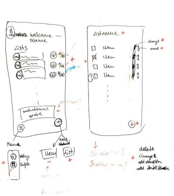
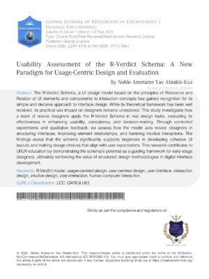
Fig. 1.1: Wireframe by P1
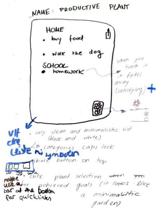
Fig. 1.2: Wireframe by p4
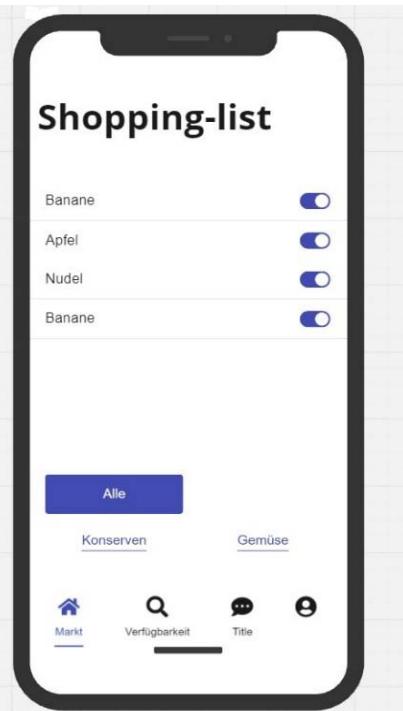
Fig. 1.3: Wireframe by P2
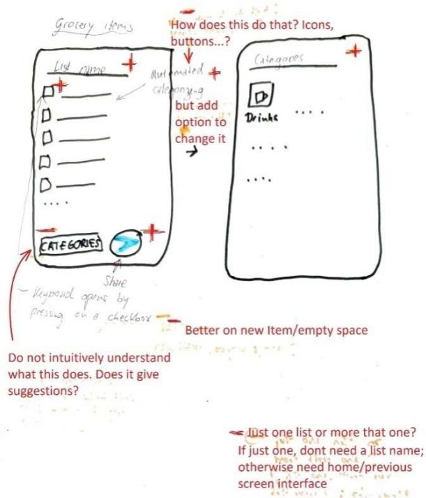
Fig. 1.4: Wireframe by P3
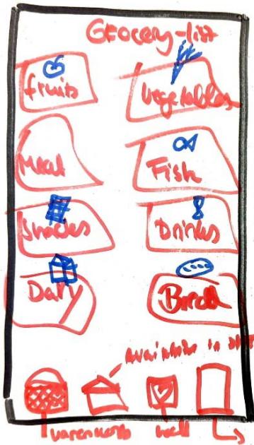
Fig. 1.5: Wireframe by P5
Table 1.3: Summarizes these proposed components from P2, P3 and P5 with review remarks review
<table><tr><td>Participant</td><td>Item (Description)</td><td>R-verdict Schema</td><td>Peer reviewer's remark</td></tr><tr><td rowspan="12">Participant 2 (Online Participants using Miro board)</td><td>Categorization by location in the supermarket</td><td></td><td></td></tr><tr><td>Prioritization</td><td>+, -</td><td></td></tr><tr><td>Multiple user (Useful when living together)</td><td>+, -</td><td></td></tr><tr><td>Product list</td><td>+, +</td><td></td></tr><tr><td>Checkbox</td><td>+, +</td><td></td></tr><tr><td>Reminder</td><td>+, -</td><td></td></tr><tr><td>Heading Label (WF)</td><td></td><td>-, -</td></tr><tr><td>Category buttons (WF)</td><td></td><td>+, +</td></tr><tr><td>Market - Navigation Icon (WF)</td><td></td><td>+, +</td></tr><tr><td>Availability/Search- Navigation Icon (WF)</td><td></td><td>+, +</td></tr><tr><td>Chat- Navigation Icon (WF)</td><td></td><td>-, -</td></tr><tr><td>Profile-Navigation Icon (WF)</td><td></td><td>-, -</td></tr><tr><td rowspan="12">Participant 3</td><td>Checkbox</td><td>+, +</td><td>Accepted</td></tr><tr><td>Sharing button</td><td>+, +</td><td>Accepted</td></tr><tr><td>Suggestion for items</td><td>-, +</td><td>Accepted</td></tr><tr><td>Symbol to visualize Category</td><td>-, +</td><td>Accepted</td></tr><tr><td>Name box (Editor's name)</td><td>-, +</td><td>Accepted</td></tr><tr><td>Title option for organization</td><td>-, +</td><td>Accepted</td></tr><tr><td>Coloring option</td><td>-, -</td><td>Accepted</td></tr><tr><td>Photo option</td><td>-, +</td><td>Not accepted</td></tr><tr><td>Price option with link to grocery shop</td><td>-, +</td><td>Accepted</td></tr><tr><td>Manual</td><td>-, +</td><td>Accepted</td></tr><tr><td>Category option</td><td>+, +</td><td>Accepted</td></tr><tr><td>Keyboard option</td><td>+, +</td><td>Accepted</td></tr><tr><td rowspan="3">Participant 5</td><td>Add item to To-do list</td><td>+, +</td><td>Accepted</td></tr><tr><td>Share button</td><td>+, +</td><td>Accepted</td></tr><tr><td>Function to push away</td><td>-, +</td><td>Accepted</td></tr></table>
P2. (WF) - Components reviewed from wireframe but not listed initially in components list sheet
<table><tr><td rowspan="4"></td><td>Reward for completed to-dos</td><td>-,+</td><td>Accepted</td></tr><tr><td>Half-screen function, as the app always remains present as a small window</td><td>-,+</td><td>Accepted</td></tr><tr><td>Categorize</td><td>+,+</td><td>Accepted</td></tr><tr><td>Collect function 2B sweet plants for continuous follow-up</td><td>-,+</td><td>Accepted</td></tr></table>
The work samples from P2 did not match the instructed pattern and thus was difficult determining points of consensus under the application of the principles of the R-verdict schema. It was however possible to analyse assessment by both parties independently. Obviously, P2 listed more functional features that UI components for usage context. Consequently, P2 focused more attention of organising UI components made available to participants, thus running into an obvious case of "feature creep" (Pringle, 2017). It is however evident that, P2 was able to self only two of his listed components/features (Product list and checkbox) were directly related to the usage context (see table 1.3).
### b) Usage-Centred Consensus
Components that showed the highest consensus are components that associate with the basic usage scenario. Between P1 and Reviewer is $60\%$ consensus. (elements like "check item option box" and "add new item" receiving unanimous $+, +$ verdicts from both P1 and P4 as well as their corresponding reviews. These components represent essential functionality for a to-do list application and were universally accepted in the final design plan. Although it will be out of place to expect exact use-case and thought pattern between participants and reviewers, the review results from the two cases reveal consensus on the components that can be easily associated with the core usage contexts. The application indicates the tendency of encouraging moderation in the fantasies that come to play in putting UI together and ensuring designers practice restraint towards minimalism.
While P1 gave "categorize item" $a-/+$,+ verdict (indicating uncertain relevance but good relation), the peer reviewer recommended its removal. Similarly, "group items" received $a-$,+ verdict from P1 but was rejected by the reviewer. On the contrary, the same component was proposed by P4 and accepted as relevant and related by reviewer. This pattern suggests differing perspectives on the complexity of functional features instead of UI elements. This disagreements is more evident in features such as "statistics of tasks done" $(-,+)$, "reminder function" $(-,+)$, and "competition with friends" $(-,+)$, all of which were accepted by P1 but rejected by the peer reviewer. This pattern suggests a tendency for designers to include features they find interesting but that may not be essential for core usage-context, which is also a common challenge in early wireframe development (Rahman & Rokonuzzaman, 2014; Pringle, 2017).
The peer review process effectively reduced feature creep by filtering out non-essential components, steering the design toward a more focused on core functionality. Figure 1.1 and 1.2 shows P1 and P4's wireframe sketched.
On the components for Grocery shopping app, there were several commonly accepted components like checkboxes, sharing buttons, categorization, and prioritization were consistently valued across participants. These commonly listed components are useful in enhancing usability and aligns with app usage needs. Some components like the photo option, chat navigation icon, and profile navigation icon were rejected due to low perceived utility or misalignment with the core purpose of app usage context (See table 1.3). Apart from P2's list and review, there was immense consensus between participants and reviewers on components that obviously owing to their commonality and clear relevance/relation to the usage context. It is however worth noting that, some participants think into extra-ordinary usage contexts or scenarios that are not common. This thought process is the causative factor for the emerging "feature creeps". Consequently, these are either detected by the participants themselves or their peer reviewers as it becomes seemingly difficult to justify the selection or placement of that feature/ component by the R-verdict schema.
## VI. POST-EXPERIMENT SURVEY
The post-experiment survey was administered to all participants and deployed via web (Google forms). The post-experiment survey was aimed at accumulating data to ascertain the possible areas that might be recommended in this report for improvement through future studies. The survey was classified into four areas and these include: learning experience (overview of the experiment session), Understanding of the model, application of the model (in planning and design and evaluation) and overall satisfaction (with open-ended suggestions or criticisms).
Presented with a 5-scale rating (excellent, good, average, poor and very poor) $20\%$ (1 out of 5) of the participants rated the training quality excellent. $60\%$ (3 out of 5) rated it as good and $20\%$ (1 out of 5) rated it as average. This reflected a fairly good commendation from the participant. On the clarity of explanation of the model and concept, the outcome was similar to the overall rating. $20\%$ rated it as excellent, $60\%$ rated it as clear $20\%$ again rated it as neutral. On the easy of comprehension (understanding the model) the participants were presented with 5-scale rating with response anchors of "very easy", "easy", "neutral", "difficult" and "very difficult". $80\%$ (4 out of 5 indicated the model was "easy" to understand. $20\%$ indicated model understanding to be neutral. This outcome also reflects a fairly good response in favor of the model. Exploring the perception of participants, 3 participant $(60\%)$ indicated that the Relevance principle was the easiest part of the model to understand. $20\%$ (1 participant) pointed to the basic ideas of the model as the easiest part to understand and the remaining participant $(20\%)$ pointed to the group task of planning an elevator control panel as the easiest-to-understand part of the model.
On the most difficult part of the model, response from participant indicate 4 (80%) of them identify the relational aspect as the most difficult to comprehend. 1 (20%) indicated the symbol assignment (+/-++) which is the convention adopted to easily apply the principles throughout the design process. When asked how confident they felt in applying the model to design using a scale with anchors of "very confident, confident, neutral, unconfident, very unconfident, the outcome was fairly positive. 60% acknowledged confidence level to be neutral, 20% indicated confident and 20% indicated very confident. With easy of application the result dropped slightly as compared to the confidence level. 20% indicated it to be very easy to apply, 40% chose easy and 40% indicated neutral.
Participant also gave responses on overall satisfaction with using the model $60\%$ of the participants indicated being satisfied, $20\%$ indicated being very satisfied and $20\%$ indicated neutral for overall satisfaction level. When asked if they would recommend the R-verdict schema to others in the field of UI design, $40\%$ of the participants indicated yes and the remaining $60\%$ indicated "maybe". This can be considered a fair outcome since most of the participant are not active in the UI design field and obviously oblivious to the current state of tools being used in the field. It would therefore be unclear to make an outright judgement of a new model being worth recommending for adoption. Thus the $40\%$ acknowledgement and the $60\%$ uncertainty in this case is statistically reasonable compared the demographic data ascertained from the pre-experiment survey. Interestingly when asked whether the schema should be incorporated into standard UI design practice, the result flipped (compared to them recommending it for others to use in the UI field). In this case $60\%$ indicated yes and $40\%$ indicated maybe. Finally with the post experiment survey, participants had the chance to give open, assessment and criticisms: Only 3 (60%) of participants gave comments.
When participants shared their thoughts on the model and the session, one key comment stood out. In Comment 3, a participant praised the model for its simplicity and ease of understanding. However, they also pointed out a limitation: the binary decision-making system (using only "+" or "-") felt too restrictive. They suggested that a broader scale or continuum could make it easier to evaluate components that were harder to categorize as purely "accepted" or "rejected." This lack of flexibility might make the model less suitable for people who aren't UI design experts. That said, the binary system is a deliberate feature of the model. Its purpose is to help designers focus on minimalism in UI design by including only essential components. Adding more options to the decision-making process could lead to unnecessary features being included, which goes against the model's goal of simplicity and efficiency. The feedback from this participant—who has some understanding of UI design—actually highlights the strength of the model in promoting minimalism. While the criticism is valid, it also shows that the model is effective in encouraging designers to prioritize only what's truly needed.
## VII. CONCLUSION
The R-verdict schema provided a common framework to effectively plan and design UI and additionally provides the same framework to evaluate the UI. As evident from the works churned it by participants (See fig. 1.1, 1.2, 1.3, 1.4, 1.5), it is clear the R-verdict schema makes it easy for both designers and evaluators to think alike in the space of the usage of the product. This is often difficult in the case of current design and evaluation models, as designers plan UI independently, users engage these products independently and even product evaluator get the chance to compose their heuristics and evaluate independent of the other stakeholders. The effect of the schema on the design choices can be seen in the changes each participant makes directly to their initial selection of components. Since the components were selected by the designers, each one of them could simply justify why they opted for the inclusion of a particular component. Evidence of change in decision on some components and sometimes absolute removal from design indicates the effect of the R-verdict schema in regulating the execution of design toward salient components. The standards and yard-stick presented by the R-verdict schema is carried through the whole life span of the product. From idea conception to periodic maintenance that might come in future.
Considering the expertise level of the participant in UI design it is not strange to have a significant number of them point to the relevance principle as the easiest to understand as it deals more with inclusion and exclusion of design elements than creative exploration of arrangements (done by the relational principle). This is reflected in the $80\%$ assertion that the organization (classification) of elements into meaningful order is the most difficult aspect of the process.
Feedback accumulated from the post-experiment survey reveals that the model is indeed capable of guiding designers towards minimalistic decisions in UI design. The plan sheets from participants reveal the broad scope with which various designers approach a task. With individual preferences and even user-persona, there is the tendency of designers sneaking in their preferences that might not really be relevant to the usage. The experiment revealed this reality and how, with the R-verdict schema, the participants actively eliminated these components to simplify their design.
As noticed from the post-experiment survey, there are other models that can comprehensively guide designers in putting together UI. With the end-goal of the r- verdict schema in mind, it will be useful when used in conjunction with existing UI models to help designers filter out relevant from irrelevant components and also classify related and unrelated components. In the context of UI evaluation, usage is key in determining the aptitude of UI. The R- verdict scheme has proven (according to this study) to be a reliable guide to fairly evaluate UI.
Generating HTML Viewer...
References
8 Cites in Article
N Ahiaklo-Kuz,M Rötting (2024). 4 Towards a Model for Intercultural HMI Design.
M Allen,R Sites (2012). Leaving ADDIE for SAM: An agile model for developing the best learning experiences.
C Calhoun,S Sahay,M Wilson (2021). Instructional design evaluation. Design for Learning.
Elassaad Elharbaoui,Jean Nteubutse,Driss Elomari (2025). Iterative Design for Adapting Engineering Learning Systems to Tunisian Education.
D Prince (2015). Approaches to summative evaluation.
Ramona Pringle (2017). 11. Testing and evaluating design prototypes: the case study of Avatar Secrets.
T Rahman,M Rokonuzzaman (2014). A Noble Methodology for Users Work Process Driven Software Requirements for Smart Handheld Devices.
Usability Assessment of the R-Verdict Schema: A New Paradigm for Usage-Centric Design and Evaluation Global Journal of Research in Engineering.
No ethics committee approval was required for this article type.
Data Availability
Not applicable for this article.
How to Cite This Article
Noble Ametame Yao Ahiaklo-Kuz. 2026. \u201cUsability Assessment of the R-Verdict Schema: A New Paradigm for Usage-Centric Design and Evaluation\u201d. Global Journal of Research in Engineering - J: General Engineering GJRE-J Volume 25 (GJRE Volume 25 Issue J1): .
Explore published articles in an immersive Augmented Reality environment. Our platform converts research papers into interactive 3D books, allowing readers to view and interact with content using AR and VR compatible devices.
Your published article is automatically converted into a realistic 3D book. Flip through pages and read research papers in a more engaging and interactive format.
The R-Verdict Schema, a UI design model based on the principles of Relevance and Relation of UI elements and components to interaction concepts has gained recognition for its simple and decisive approach to interface design. While its theoretical framework has been well received, its practical use impact on designers remains unexplored. This study investigates how a team of novice designers apply the R-Verdict Schema in real design tasks, evaluating its effectiveness in enhancing usability, consistency, and decision-making. Through controlled experiments and qualitative feedback, we assess how the model aids novice designers in structuring interfaces, improving element relationships, and fostering intuitive interactions. The findings reveal that the schema significantly supports beginners in developing cohesive UI layouts and making design choices that align with user expectations. This research contributes to UI/UX education by demonstrating the schema’s potential as a guiding framework for early-stage designers, ultimately reinforcing the value of structured design methodologies in digital interface development.
Our website is actively being updated, and changes may occur frequently. Please clear your browser cache if needed. For feedback or error reporting, please email [email protected]
Thank you for connecting with us. We will respond to you shortly.