

INTRODUCTION
The world in which decisions are made is complex. Veselý (2015) states that, with respect to policy decisions, the characteristics of policy makers, their institutional arrangements, their work processes, outcomes and effects of those outcomes need to be considered. Within that complexity the use of data is a common thread. One theoretical framework for the use of data in decision making is given by Mandinach (2006). It involves the transformation of data to information then to knowledge that can be applied to decisions. This is based on six steps: collecting, organizing, summarizing, analyzing, synthesizing, and decision-making, in a process of making data meaningful within the context that created it. Statistics is about the collection, analysis, display and interpretation of data and it contributes to knowledge by providing evidence for decision making but the caveats and limitations associated with this evidence also need to be taken into account.
Marriott et al (2010) stated that statistics is about solving real-world problems and that it uses mathematics but this is not the only skill required. Real-world problems are often complex involving multidisciplinary teams with members having varying levels of statistical or mathematical skill. The statistician may have the mathematical skills but is rarely the decision-maker or developer of policy, and needs to learn from the experts what their actual problem is. The decision maker need not have the same level of mathematical skill but does need to understand what the underlying statistical concepts mean within their data. What are the other skills that today’s statisticians should have? They need to be more than mathematically competent having a range of skills as well as conceptual understanding of the methods that they use. Spiegelhalter (2024) suggests that statisticians should be better communicators of the ‘uncertainties’ associated with their analyses and cites the classification of uncertainties into ‘known knowns’, ‘known unknowns’, and ‘unknown unknowns’ given by US Secretary of Defence, Donald Rumsfeld in 2002. In terms of their application to statistics, ‘known unknowns’ include measurable sampling error and ‘goodness of fit’ of models to the data and ‘unknown unknowns’ include systematic (in-built) biases, authenticity of data and timeliness of analyses in a world of rapid change. External ‘unknowns’ such as global events can also affect the data’s usefulness in decision making. Statisticians also need to understand the ethics underlying data collection and dissemination and the providence of their data (history and changes documented in its metadata – data about the data) as well as being effective communicators able to describe what the methods they use are doing to and with the data.
Developing all these skills should be part of any statistics curriculum but are equally important for policy developers and other decision-makers to understand so they can know the limitations of their data and analyses as they synthesize these into decision-making knowledge. However, within this framework they do sometimes have to make decisions using the data currently available, acknowledging that making no decision can incur an even greater social or monetary cost. As users of statistics, these learners need to be able to interpret the analyses they are presented with but not the details of the underlying mathematics. Their decisions are made within the real-world of change, chance and variation so they need not only to understand the u statistical concepts and caveats related to their data but also that, as de Costa Garcia states (Reislien & da Cost Garcia, 2025) ‘statistics are abstractions of reality’. All real data exists in a particular time and place (even though these variables are often ignored) and the further we move away from either time or place introduces more ‘uncertainty’ into our analyses. The true analytical power of statistics in the real world is when it is treated as a science with repeatability and accumulation of evidence being important considerations.
Over the past 20-30 years teaching Government policy managers and planners in New Zealand (mainly in the School of Government at Victoria University in Wellington) and internationally (in Egypt, Iran and Tonga, 2012) I found these learners often had highly variable mathematical and statistical skills but many of the same curriculum needs as statistics learners, with less emphasis on the mathematical content. An important additional requirement of these policy and decision makers, is being familiar with those measures of uncertainty (economic, environmental, population and societal factors) that are external to their specific data but impact on the implementation (e.g. costs) of their decisions over time. Statisticians working with real-world data should also understand these measures and the use of data visualisations in the teaching of two of these measures, inflation and demography, is discussed in the paper.
The focus of the paper is the use of data visualisations and e-learning tools not only to teach all learners important basic statistics concepts but also as motivational tools demonstrating real-world applications and important policy uses of statistics. The paper is structured according to the teaching aspect being discussed (statistical concepts, geographic statistics, data quality, factors affecting the implementation of decisions, the global power of statistics and use of self-teaching e-learning tools). The use of visual tools to initiate discussions about uncertainties related to the data they contain is also discussed as well as their increasing use as analytical devices. However, not all of these tools are equally useful in the classroom and some caveats and pitfalls are also given.
While much of the feedback on the effectiveness of the tools is from the teacher’s perspective feedback from students in two formal courses, an across-university Honours course in Official Statistics and a Master of Public Policy course at Victoria University in New Zealand in 2012, and a small 2-day Victoria University continuing education course for policy advisors in 2017 is also given.
BACKGROUND AND METHOD
The use of tools that enable data and analyses to be viewed visually can increase decision-makers’ understanding of the quality of the statistical processes (collection, analysis and interpretation) associated with their data. The effectiveness of their use in the classroom in terms of demonstrating concepts, or leading to discussions about data sources and quality is given from both the teacher’s perspective and, where available, the students’ perspective.
Almost all of data visualisations discussed below were used in the following international (usually one-week) courses:
Getting Better Value from Official Statistics to policy managers in the Prime Minister’s Information and Decision Support Centre (IDSC), Cairo, Egypt (2010)
Certificate of Official Statistics to members of the national statistics office and other government managers, Nuku’alofa, Tonga (2012)
Using Official Statistics for Government decision making to Department of Statistics managers, Statistical Training Centre, Tehran, Iran (2012) but feedback on their use was not obtained specifically so only the teacher’s perspective is given.
The Honours course mentioned above is an example of where technology is changing the way we teach by enabling online collaborative training to take place. In New Zealand the use of a specialized video-conferencing network linking universities allowed experts from different universities and the national statistics office in key areas of Official Statistics (e.g. demography, geostatistics, economic, health and social statistics) to simultaneously teach students at all participating universities in an Honours course on Official Statistics in one class, from a studio at their own institution. This enabled key aspects of Official Statistics, as distinct from other branches of statistics to be covered such as: legal and ethical constraints on organizations producing Official Statistics; principal methods for data collection, analysis and interpretation of health, social and economic data, including spatial data; probabilistic data matching of surveys and methods for presenting and preparing Official Statistics commentaries. The entry requirement to the course is at least one stage 2 basic statistics paper and it has a dedicated website with all lectures being recorded and accessible by students. It was first offered in 2012 and in 2025 77 students were enrolled. At the end of the course in its first year the 29 students were given a 13-question Likert-style questionnaire (Harraway and Forbes, 2013) and the results are reported below.
A number of data visualisations were used in the previously mentioned Master of Public Policy course with the 17 students being asked (by show of hands) whether they liked using the tool and whether it helped them understand the concept being discussed. Where relevant their feedback is reported.
It is not easy to get feedback from anonymous online users but the level of usage of the two e-learning tools discussed in the paper is given. One of these tools was used in the continuing education course and the nine participants were sent a SurveyMonkey Likert-style questionnaire after the course about this. Their responses are also reported.
USING DATA VISUALISATIONS TO TEACH BASIC STATISTICAL CONCEPTS
Data visualisation has been used for some time to demonstrate statistical measures without requiring knowledge of the underlying mathematics and there is already a lot of research on the use of visual tools to teach statistical concepts in the statistics school and early university class-rooms (Chance et al (2007); Budgett & Wild (2014), etc.). My classroom focus has been on the use of visual tools to help explain the concepts underlying statistical measures without focussing on the mathematics. A simple example is showing visually that the mean is the balancing point of a set of data and that this is not always the same as the middle point of the data. This then also provides a platform to introduce the concepts of skew and outliers. There are a number of YouTube videos available that teach the mean as a balance point and a very simple example (Figure 1) is given on the Mathspace website https://mathspace.co/textbooks/syllabuses/Syllabus-1191/topics/Topic-23231/subtopics/Subtopic-287494/?coreTextbookSubtopicActiveTab=solidifyLesson&activeLessonTab=content but I have yet to find one that I can input real data such as Income to.
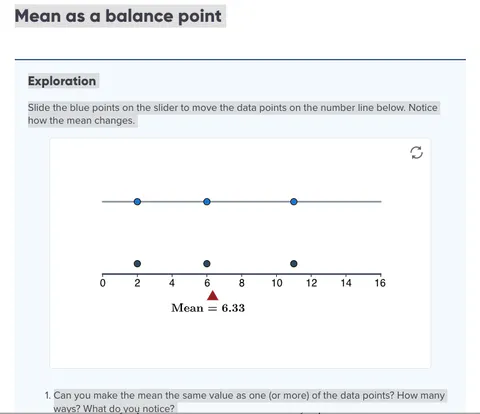
Mathspace Exercise on the Mean as a Balance Point
Visualising data can also be used when introducing multivariate concepts. Reislien (Reislien & da Cost Garcia, 2025) uses the analogy of “walking the dog” to explain randomness and linear association between two variables (as the overall direction walked) without presenting any formulae. In the policy analyst’s classroom, I first introduce the concept of ‘a line of best fit’ by getting the learners to create a ‘living scattergram’ (Joiner, 1975) of their pulse rate before and after exercise by constructing axes on the floor for before and after pulse rates, then getting students to stand at the point on the graph where their values intersect. A rope is then used to try to determine the line of best fit (leading to debate about what criteria we should use and the introduction of the concept of least squares). Following this I used the scatterplot (Figure 2) of a small (200 records) synthetic (to maintain confidentiality) unit record file from the 2004 New Zealand Income Survey and discussed the real-world interpretation (no hours worked results in no income, and $17 per hour was then close to the minimum wage in New Zealand) of the values in the given line of best fit:
Weekly Income =$(17.1 Hours Worked + 0.35), r 2 = 0.63 (measure of uncertainty).
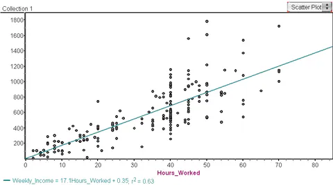
Simple regression: Weekly income by Hours Worked
It is a large step conceptually from simple regression using two variables to multiple regression models that may or may not incorporate interactive terms (where one variable acts as a modifier on another). The three-dimension (3-D) display (in Figure 2a below) is a pin-graph where the heads of the pins form a 3-D scatterplot that shows the relationship between Income and Hours Worked isn't the same across all Qualification Levels indicating that there is some interaction between these variables. Although multiple regression analysis can be used to estimate the strength of any interaction, the focus of the visual tool is on interpretation and explanation of the output not the technique itself.
In Figure 2b (Weekly Income by Hours Worked by Age by Gender) extension from three to four dimensions has been achieved by the use of colour to distinguish between males (red) and females (blue) and shows that part-time work (<40 hours per week) is dominated by females (blue) and full-time work by males (red) indicating that these two groups behave differently (and possibly should be analysed separately).
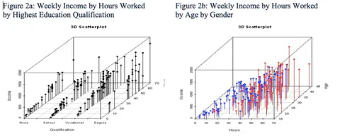
While statistics learners generally found these graphs helpful only two of the 17 Public Policy students agreed that they both liked and found them helpful. While the specific form of the cognitive load for these students (the increase in dimensionality, the introduction of a new form of graphic or the combination of the two) is unknown (and is an area for future research) it is likely that at this time both pin-graphs and 3-D graphs were unfamiliar for most of these students. Digital literacy has evolved substantially over the decade since the 3-D pin-graphs above were used in these classrooms but familiarity, simplicity, ease of use and the learners’ previous skill set still need to be carefully considered by teachers when using visual tools.
Beyond three dimensions
It seems that while humans primarily see in 3 dimensions our brains can think in many dimensions at the same time. We are no longer constrained to 3 dimensions. Changing the size, or intensity of colour, of individual data points or adding a dynamic feature to move between overlaid static graphs can increase dimensionality. For example, Rosling (2007) used different colours to indicate World Regions, circle area to indicate Population Size and a dynamic feature playing across years to show Change Across Time in the creation of his Gapminder graphs (available at https://www.gapminder.org/tools/#$chart-type=bubbles&url=v2). These graphs (e.g. Figure 3) were used to investigate differences between countries in important global measures (e.g. mean life expectancy, GDP per capita, etc.) as a demonstration of the international use and power of statistics and also to generate classroom discussion about where the data came from (source), what data there is about the data (metadata) and data quality over time. Learners can interact with the visualisation by changing the variables on the axes and in the circles, by selecting countries of interest and the speed at which it is played across time. His “From Sick and Poor to Wealthy and Rich” BBC4 YouTube video (Rosling, 2010) (https://www.youtube.com/watch?v=jbkSRLYSojo) shows the trend for most countries to become wealthier and have higher life expectancy between 1810 to 2010. The video is an excellent example of the statistician ‘telling the story’ of the data, a skill that teachers of statistics should try to develop in their students but may require different forms of assessment (e.g. oral or written presentations) than traditional timed written examinations. In my classroom, after viewing the video discussion of the possible impact of the (in 2010) ‘unknown’ uncertainties (e.g. the 2019 global Covid pandemic) and ‘known’ uncertainties (e.g. Russia/Ukraine and Israel/Palestine wars) on a range of variables following 2010 was used to increase students’ understanding of why we are wary of extending trend estimates too far into the future. This was a popular visualisation and a number of students reported accessing the tool and playing with it in their own time.
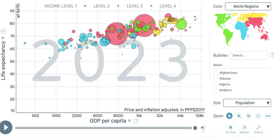
Hans Rosling’s Gapminder Tool
USING MAPS TO SHOW AND ANALYSE GEOGRAPHIC STATISTICS
The rapid growth of geo-visualisations (such as the Worldmapper tool (https://worldmapper.org/) that displays cartograms representing a country’s land map by its proportion of some variable such as Extinct Species (shown in Figure 4) in popular media means that we can no longer ignore the inherent dimension of geography (where the data comes from) in either our teaching or analyses of statistics. Most national statistics offices now routinely produce interactive and dynamic (can be played across time) geo-visualisations of macro-level data (e.g. the GeoSpatial Visualisation given in Figure 5 and available on India’s Ministry of Statistics and Programme Implementation (MOSPI) website (https://www.mospi.gov.in/dataviz)).
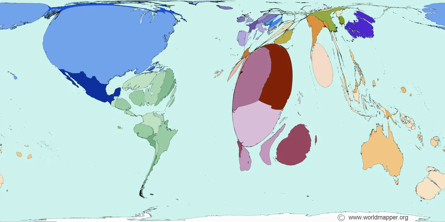
The world by the proportion of extinct species: 1500- 2004
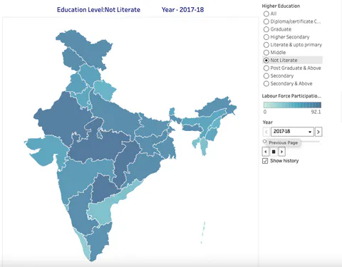
Education level wise Labour Force Participation Rate (%) of Persons (15 years & above) in Rural+Urban Sector at Usual Status (PS+SS) during 2017-18 to 2023-24
Maps are now used both to present and to analyse data. Tools such as heat maps (that use brighter or darker colours to represent higher values and lighter colours to represent smaller values) are being used to analyse health and other social statistics (e.g. Exeter, 2025) and are often easier for non-statistical learners to interpret than traditional tables of data. If each point in a data set has its geography referenced (e.g. using GIS: Geography Information System) then geo-visualisation tools can be used to integrate maps and graphs with traditional statistical analyses and can be an effective presentation and exploratory tool. As stated previously in Forbes (2012) the rapid growth in everyday use of data visualisations has implications for how we teach and on what we teach in our statistics courses. Perhaps the use and interpretation of these tools should now be part of any curriculum containing statistics.
However, care needs to be taken in the classroom to ensure that these visual tools are simple and easy for learners to use. In both the above Official Statistics Honours and Public Policy courses I used the GeoVISTA software (GeoVISTA Center, 2012) to explore the geographic distribution of 1991 New Zealand Census variables (Figure 6). It gave me, the teacher, an opportunity to incorporate and discuss well-known simple graphics (e.g. histograms and scatterplots) with newer graphics such as the star plot (upper left-hand corner) and the cartogram (lower left-hand corner) and also to highlight the position of outliers (e.g. the large island in the top right) simultaneously across all the graphs and discuss whether outliers on one variable were also outliers on others.
Both groups of students found it ‘too busy’ and not easy to interpret, having to be directed to look at each graph separately. A learning exercise for the teacher to not get carried away! Good graphics should be simple and focus on just one concept at a time. Teachers not only have to help learners differentiate between useful/good and not useful/bad visual tools, but also develop this skill themselves.
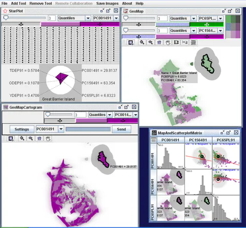
GeoVista display of population age groups in Auckland city (1991 Census data)
ASSESSING THE QUALITY OF DATA AND ITS INTENDED USE
Teachers of statistics need a range of tools to assist them to develop the skills their learners need in addition to understanding the results of analyses. These include determining the availability of data and the quality of that data. One e-learning tool that I used to initiate discussion is from the set of videos of experts describing their problems developed by Harraway et al (2022) at the University of Otago https://www.stats.otago.ac.nz/research/Statistics-in-Research/. These videos are accompanied by data and lessons targeted at statistics students in schools and universities, but can also be used as case studies with a wider group of learners. One video (Figure 7) that provided material for generating discussion about determining the exact question to be answered, the availability of data and the quality of that data was ‘Estimating the Global Burden of Novavirus’ https://www.stats.otago.ac.nz/research/Statistics-in-Research/13-GlobalBurden_Lesson.html. The expert, Professor Julie Legler from St. Olaf College in Minnesoata, details that one of the incentives for this work was a generous donation of US$750million from the Gates Foundation to the World Health Organisation (WHO) vaccine group. Deaths from diarrhoea have multiple causes of which one is Rotavirus but there is much better data available for overall diarrhoea deaths than specifically for Rotavirus, particularly in poorer nations such as in Africa (that account for 45% of all global childhood diarrhoea deaths). She describes the methods used in the case study (imputation using an overall mean, stratified means, linear regression (single and multiple), bootstrap confidence interval for the sum and correlation between variables) to estimate the global total of Rotavirus deaths. Even though these methods were unfamiliar to most of the public policy students it was obvious to them that the disparities between countries in data availability and quality meant none were perfect for targeting use of the Rotavirus vaccine. The example helped the students understand that in the real world sometimes the cost of ‘doing nothing’ is much higher than the cost of doing ‘the best we can with the available data’. The decision on whether or not to do this should be made by the policy maker as part of their risk analysis in the synthesis and decision-making aspects of the six-step framework for using data in decision-making mentioned previously.
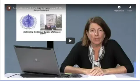
Screen-shot from the Estimating the Global Burden of Rotavirus video
The quality of data used should be related to the importance of the issue being investigated. For example, a tourist wishing to know about relative prices between two countries might be happy to use the Big Mac Index https://worldpopulationreview.com/country-rankings/big-mac-index-by-country as a quick guide. This compares the price of a ‘MacDonalds’ Big Mac hamburger in each country to that currently in the US (e.g. in 2024, the price in New Zealand was US$4.99 compared to US$5.69 in the US, a difference of -12.72%). Students enjoyed playing with the tool, but readily accepted that it would not be sufficient for a major exporter wanting to know about the overall difference in prices for similar goods (Purchasing Price Parity) between two countries. Much of the highest quality data available is produced by government agencies or reputable research /academic institutions but is often available for public use and reuse.
INVESTIGATING FACTORS THAT IMPACT ON POLICY IMPLEMENATION.
All members of teams working on real-world problems need to understand the factors that impact on the implementation of decisions resulting from their analyses. National statistics offices often provide the most robust estimates of the economic, environmental, population and societal changes and trends that can impact on policies over time. The following examples show how data visualisations can help learners understand the concepts underlying two of these measures (inflation, and population change) and also lead to discussions about other data related issues and uncertainties.
Inflation
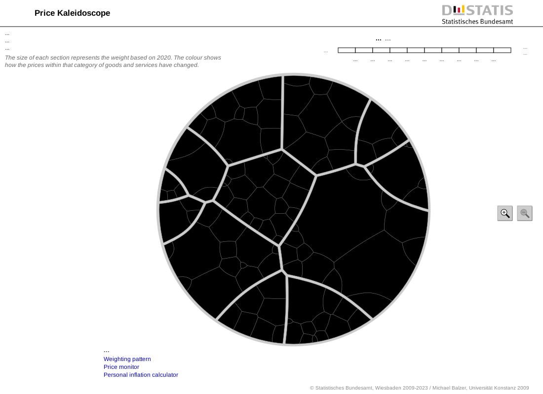
In general, costs estimated at the time of implementation of policies need to include a measure of inflation for potential increases in costs over time. The most common measure of inflation is the Consumer’s Price Index (CPI) that measures the price change of a set of goods and services (the basket of goods) purchased by households. In New Zealand as in many other countries, it is used to set monetary policy, adjust benefit rates and in wage negotiations, and is frequently reported by the media. The term Consumer Price Index is familiar to students but often they have no real understanding of how it is derived. When teaching index numbers such as the CPI, weighting seems to be a difficult concept for students to grasp and data visualisations can help with this. The Price Kaleidoscope https://service.destatis.de/Voronoi/PriceKaleidoscope.svg (Figure 8) produced by the German Statistics office demonstrates how the expenditure weight (proportion of the circle determined by a separate household expenditure survey) assigned to each good or service impacts on the overall value of the index. Clicking on any area displays its weight and quarterly change in prices. Students in both the Honours and Public Policy courses quickly became actively engaged with the tool and used its interactive feature to explore weights and price changes, observing that while some subgroups have large positive or negative price changes the impact on the total CPI is largely determined by its weight (area). This lead naturally to student-initiated discussion of how the weights are derived providing the teacher with an opportunity to discuss potential sources of error (including ‘known’ uncertainties such as sampling error through the measurement of both the weights and prices through surveys) and the concept of ‘controlling for variation’ by keeping one variable, the priced ‘basket of goods’, constant between price surveys.
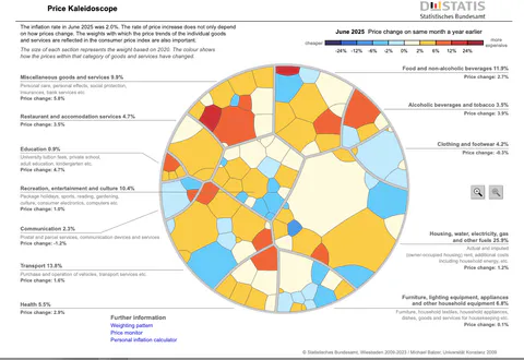
German Statistics Office Price Kaleidoscope
I found an effective way to teach (and assess) understanding of this measure was to have students collect their own expenditure over a period of time, derive their own weights, compare these to the national ones and discuss reasons for any differences between the two. To do this only requires a knowledge of percentages, but was extended mathematically in the Honours course where the students were given an assignment in which they collected their own expenditure data over a two month period, derived their own weights and then used them to calculate their Laspeyres index, commenting on differences between their results and the official CPI. All 29 students in the course correctly calculated their personal weights, 28 gave sensible reasons why their weights differed from the official ones and 23 correctly calculated the index. While there is no directly comparable evidence with traditional mathematical teaching of this index, from the teacher’s perspective it was a positive result.
Population dynamics
Those policies (such as in health and education) that involve groups of people are impacted upon by changes over time in those populations, and also differences between population subgroups (e.g. regions or ethnic groups). Dynamic population pyramids provide an effective tool for looking at past population dynamics and estimating future changes as well as demonstrating the demographic concept of momentum and its components: fertility, mortality and migration. They can indicate areas of growth or decline that may be important considerations for health, education and economic policy advisers. Figure 9 shows the current Statistics New Zealand dynamic population pyramid https://www.stats.govt.nz/tools/interactive-population-pyramid-for-new-zealand/ that can be played across time from 1936 until 2078 (using population estimates for future years). The bulge shown in 1978 in 5-25year-olds reflects high birth rates following the end of the second World War.
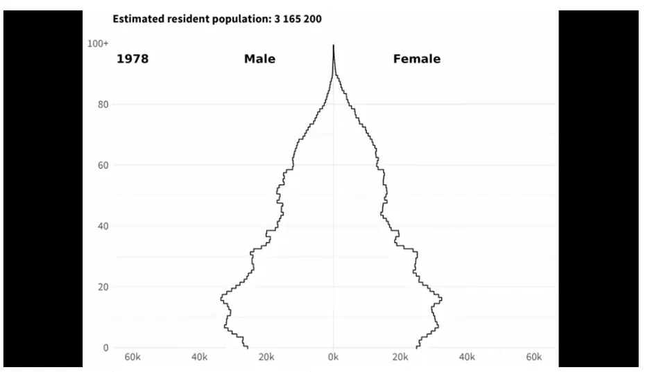
New Zealand Dynamic Population Pyramid
Population pyramids can also be used to look at ethnic or regional differences in the population age structure as shown in Figure 10 from the UK Statistics Office’s dynamic population pyramid https://www.ons.gov.uk/peoplepopulationandcommunity/populationandmigration/populationestimates/articles/ukpopulationpyramidinteractive/2020-01-08. This shows that Oxford (a major university city) consistently has a far higher proportion of 20-30year-olds than the national population which will affect local planning policies.
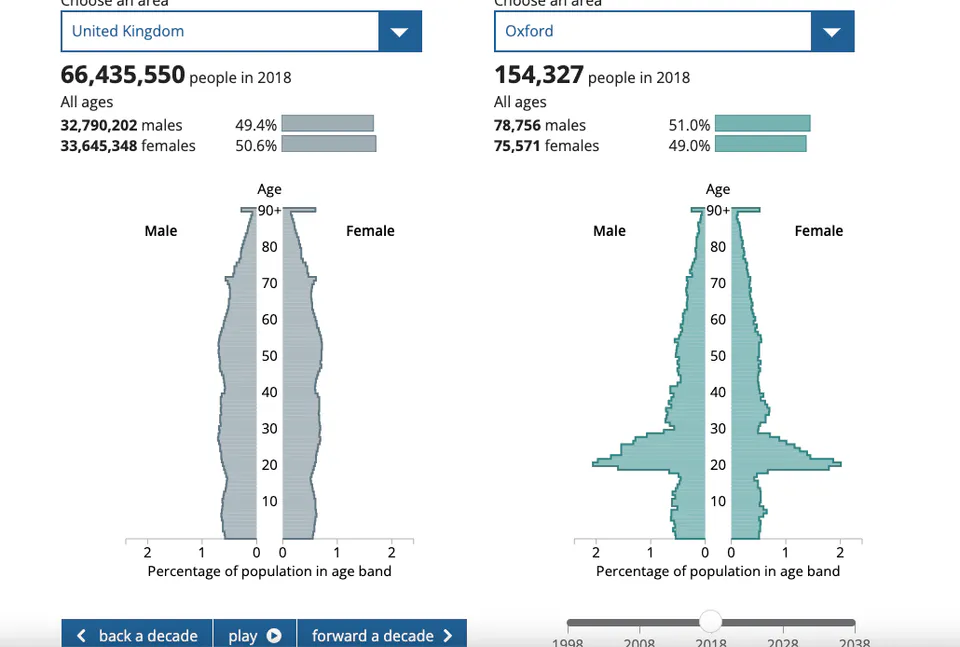
United Kingdom Dynamic Population Pyramid
This visualisation can also be used to investigate student conjectures such as whether or not city is ‘dying’ in terms of growth or decline in particular age-groups of its population.
All of the Public Policy students indicated that they both enjoyed these two visualisations and that they helped them understand the concepts being discussed.
THE POWER OF STATISTICS IN THE REAL WORLD
International sharing and communication of statistics is now common with AI enabling inter-country comparisons to be made rapidly (although verification of data remains an issue). Access to global statistics has also increased both through the United Nations and its agencies and also websites such as Our World in Data https://ourworldindata.org/ as shown in Figure 12, and can be used in the classroom to discuss global issues or challenge preconceptions. For example, Figure 12 demonstrates the disparity in size between Asian and other populations with 1 in 3 of the global population currently residing in either India or China.
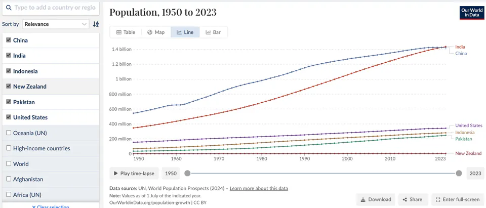
Population Growth 1950-2023 by country (https://ourworldindata.org/population-growth)
Examples that can be used to both motivate learners of statistics and emphasise the importance of repeated analyses and accumulated evidence include the growing awareness of global warming, responses to the 2019 COVID pandemic and the changes in global attitudes towards smoking. As in many other countries, in New Zealand over time there has been a 180o turn in Government smoking policies (Appendix 1) with policy responses moving, as more data became available, from educational campaigns, to regulations on advertising and purchasing age restrictions through to national Smoke Free legislation. Appendix 1 was used with the Public Policy students to demonstrate that while medical evidence on the health damage from smoking was available in the 1940s it was not until the Surgeon General had accumulated substantial evidence from a number of sources in the 1960s that serious policy changes were initiated. Students were also shown estimates of the cost of doing nothing in New Zealand (derived by Easton (1995) and the Cancer Society of New Zealand (2004) who analysed the costs of care and hospitalisation for smoking related illnesses and the loss-opportunity costs of early deaths). These gave the social cost in 1990 to be a reduction in the New Zealand: population of about 2.0% (80,000 people); overall quality of life (intangible costs) of about 3.2%; production from morbidity and premature mortality of about NZ$545 million and in GDP (of around 1.7%) showing that not making or delaying decisions came at a high cost.
USE OF SELF-TEACHING E-LEARNING TOOLS
Traditional mathematics and statistics textbooks seem to be becoming past their ‘use by date’ with students now able to access much of this material on the internet. This does allow them to learn in their own time and at their own pace but they need guidance as to which tools are the most appropriate. Where the technology is available today’s teachers can also use and re-use good e-learning tools within their classes. The Otago University videos mentioned above are one example.
I have been associated with two free to access e-learning tools, both of which included many of the above data visualisations and also links to other websites. The first are three web apps hosted on the International Statistical Literacy Project (ILSP) resources page of the International Association of Statistics Education website https://fpce.uc.pt/iase-web/islp/Resources.php.html.
Measuring Price Change (focusing on the Consumer Price Index (CPI)): (working with price indices, changing base year, time series, moving averages, trends, and seasonality)
Comparing populations: (over time, between countries and groups within countries using demographic techniques: fertility, mortality, migration, life tables, population pyramids, age standardisation and odds ratios).
Graph It in Excel: (overview of the history of graphics, examples of good and bad graphics and instructions for creating a range of simple graphs in Excel (including boxplots and population pyramids)
The web apps were developed by an international team: myself and John Harraway from New Zealand; Neville Davies, Dominic Martignetti and Kate Richards from Plymouth University in the United Kingdom together with assistance from other staff at the University of Otago in New Zealand as described in detail in Forbes & Harraway (2021). The first two are about the aspects of Official Statistics discussed previously and both contain an introductory video, commentary (history and policy uses, etc.) on the left-hand side and teaching instructions on the right-hand side as shown in Figure 13. Teaching material uses structured learning with text and worked examples followed by exercises with increasing levels of difficulty for learners to attempt (after three wrong attempts they are shown the correct answer) with learners able to dip in and out of the web apps to access just the material they need. The third web app was deliberately aimed at policy developers who not only have to determine whether a graphic is good or not, but sometimes have to create simple ones themselves usually in the software they have available (Excel).
Screen-shot of the Measuring Price Change web app
Each web app had the following unique visits in the 7 years up to November 2024:
Measuring Price Change: 24295
Comparing populations: 23149
Graph It in Excel: 31720
Users came from 60 countries ranging from the United States and China (the greatest users) to Moldova.
The web apps were used to teach in a small 2-day university Continuing Education course for local and national policy advisors where the nine participants downloaded them on to their own devices (Forbes et al, 2018), Seven of the nine participants responded to a SurveyMonkey questionnaire sent to them after the course with only one replying that they found any difficulty using the apps. Worked Examples and Structured Exercises With Answers were listed as the most useful aspects of the web apps, and all students stated that they would recommend them to others. In the Official Statistics Honours course students used the Graph It web app to complete an assignment involving the creation of a population pyramid with no reported difficulty and most students receiving high marks.
The second free and self-paced e-learning tool was the United Nations Institute of Training and Research (UNITAR) Massive Open Online Course (MOOC), Understanding Data and Statistics Better - For More Effective SDG (Sustainable Development Goals) Decision Making. The course was targeted at an international audience of persons developing policy or monitoring progress towards the United Nations’ Sustainable Development Goals (SDGs) who needed to upgrade their statistical skills. It contained 5 modules, each with an estimated learning time of 2-5 hours:
Statistical literacy (basic statistical skills up to simple bivariate measures); Interpreting and assessing the fitness of or purpose of data; Communicating with data (using words, tables, and visualisations); Data sources for SDG indicators and Policy formulation, monitoring, and evaluation. The course focused on: telling stories with data (using case studies at the beginning of each module), conceptual rather than mathematical understanding; using visual tools to interpret data; recreating as little material as possible by using online resources, and assessing learning online as students progressed. Each module contained questions and hands-on exercises including online flip charts and games together with a final assessment consisting of 10 randomly selected questions. Learners gained either a Certificate of Participation by completing 4 of the 5 modules or a Certificate of Completion by passing a final online test.
Over 1,100 learners from more than 50 countries accessed the course, including learners from Africa (in particular Nigeria and Ghana), Asia (especially India), and most European, Middle Eastern, and South American countries as well as Canada, the US, and the Pacific. It ran from early 2020 to 2023 and while it is no longer available it is hoped that it will be offered again in the near future.
CAVEATS ON THE USE OF VISUALISATION AND E-LEARNING TOOLS
Widespread and equitable availability of technological resources for students, both in classrooms and their homes, is probably the greatest barrier to increased use of data visualisations and e-learning tools.
In times of fiscal constraint national statistics offices often reduce the complexity of publicly available visual tools. As an example, for a time many countries had dynamic population pyramids that users could interact with (e.g. such as that currently available at the Australian Bureau of Statistics https://www.abs.gov.au/statistics/people/population/population-clock-pyramid) but currently a number of agencies have either stopped producing these, simplified the output (e.g. the UK version in Figure 10 now only contains data for the years 1998 - 2038) or use cheaper visual tools (for example, Statistics New Zealand ’s (Figure 9) is now only available as a YouTube video).
Visualisation tools that use large amounts of data are also often discontinued. A CommuterView mapping tool produced by Statistics New Zealand (Forbes, 2012) that displayed linked information from two 2006 New Zealand Census of Population and Dwellings questions: ‘Where do you live?’ and ‘Where do you work?’ had, at the level of geography displayed in Figure 11, more than 3 million data cells. While this amount of information can only realistically be displayed and explored graphically, and was an effective interactive tool for local authority policy planners (e.g. in Figure 11 showing that many critical employees of the capital city’s only major hospital lived some distance away) it was only ever produced once.
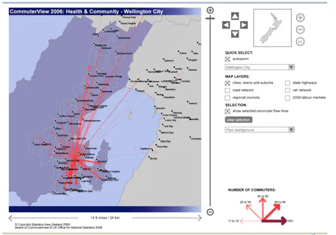
New Zealand Commuter Flows: Work to Home, Wellington City
Not only are these tools expensive to create and maintain, as time passes real world examples and exercises may lose relevancy, and keeping material current becomes an issue, particularly if ongoing funding is not available. Funding of both of the e-learning tools described above was primarily for development and initial use, but not for ongoing use or maintenance.
As with both e-learning tools, most similar online teaching tools contain data visualisations and/or online links to other websites so are also subject to the caveats that apply to these. These include: being able to assess the authenticity and source of the data, as well as its quality; the ease of interpretation (with some visual tools being too complex). Familiarity with graphics, simplicity (having a single focus), being easy to use and the learners’ previous skill set also need to be carefully considered by teachers when using visualisations in the classroom.
Another major issue is that displaying data visually can mask its quality and variation. For example, if visualisations are of data aggregates (e.g. counts, proportions or point estimates such as sample means) then the underlying variability in the data is not apparent to the user. This is a particular concern with visualisations of survey data and needs careful explanation to statistics users.
If a visualisation looks slick and professional then the data contained within it may be simply accepted as true when it is not, leading to misinformation.
DISCUSSION
Visual and online tools have become part of many learners lives and are changing the way we teach. Ten of the 29 students in the Official Statistics Honours course responded to a Likert-style questionnaire, with nine of the ten noting that distance learning was not an impediment to learning, that they valued highly what they had learned and that the quality of the course was good to excellent. All ten had viewed the recorded lectures at least two times. The level of usage of the two e-learning tools indicates there is demand for free online self-teaching material. In classes where students can use their own devices, online courses can provide an additional mode of teaching and assessment.
Student responses indicate that data visualisations can be helpful teaching aids in particular for demonstrating statistics concepts. The geo-visualisations used in the classroom reinforced that all data comes from a place, and for those that had an additional dynamic feature, that data also changes over time. Two of the important aspects of data visualisations were, from a teaching perspective, that they displayed real data that students could relate to and that they allowed large sets of data to be easily displayed and investigated. Students in the courses above showed a clear preference for simple tools that they could interact with, such as Gapminder, the Price Kaleidoscope and Dynamic Population Pyramids with a number reporting accessing them outside the classroom on their own devices.
Public policy students clearly indicated that they found unfamiliar graphical forms such as star-plots, cartograms or three-dimensional graphs difficult. The fundamental principle of good graphs that they be simple and focus on just one concept at a time applies equally to interactive and dynamic visualisations.
CONCLUSION
Some of the visualisations above provided new ways of displaying data, and those that were interactive, gave learners hands-on tools for further analysis. In the classroom they provided simple tools to explore patterns and relationships in large data sets, motivate student learning by providing simulation opportunities, show real-life applications of statistics and initiate discussion of new, as well as familiar, graphical representations of data. In general, they are hands-on and fun tools that students can use themselves, in itself a reason for teachers to make more use of them. In addition, they often provide a natural segue into discussion of ‘uncertainties’ related to the data being displayed.
The growth of geo-visualisation in popular media helps reinforce the multivariate and interdisciplinary nature of statistics, but also means that we can no longer ignore the inherent dimension of geography in either our teaching or analyses of statistics. Geo-visualisations used in the classroom reinforce that all data comes from a place, and for those that have an additional dynamic feature, that data also changes over time. Perhaps the most important feature of many of these tools is that they allow us to see the real power of statistics, as a science demonstrating the use repeated and accumulated evidence, in particular to address issues of global importance.
From a teaching perspective, data visualisations show, rather than simply describe in mathematics, statistical concepts to learners. That is, they help teachers make abstract ideas concrete. This is particularly useful for those concepts (such as skew, interaction, demographic momentum, weighting and controlling for variation) that students often find difficult. The most effective visual tools in the classroom were those that were simple and allowed user interaction.
E-learning tools designed specifically for teaching not only provide free access and self-paced learning for many statistics learners and decision-makers but can also be used by teachers either to supplement and enhance traditional classroom activities or to replace whole sections of learning. These new tools may seem daunting to teachers who have themselves learnt in a traditional way but they need only use those they think will help their students learn.
Data visualisations and e-learning tools are expensive to create, maintain and keep up-to-date. They can also be used to misinform and care needs to be taken to ensure they come from reputable sources. As the demand for visualisation and online learning tools increases, both statistics users and educators need to increase their knowledge about their advantages, disadvantages, and appropriate uses. In particular, it is a changing world for the teacher of statistics, away from the traditional focus on the mathematics to teaching conceptual understanding, fit for purpose and constraints on use. The challenge for these teachers is to see through the mathematics to what is happening in the data and be able to convey this to their students. Visual and online tools can assist in this regard and teachers do not have to create these tools themselves; just explore, use and share with others those that enhance learning.