CO2 emission has an adverse effect on the environment and cause greenhouse effect with significant negative climatic changes. This subsequently lead global warming which hurts both human and crops. It is important for us to perform visual analysis with available dataset using Canada as a case study.
## I. INTRODUCTION
The progress in technological development has led to few negative effects on the climate. Carbon Dioxide is the major compound accountable for climatic change (Nataly and Yiu, 2014). Consumption of automobile fuel produces CO2 emission globally. As claimed by USEAP 2022, a standard vehicle releases about 4.6 metric tonnes of CO2 annually. A study by Environment Canada in 2015 shown that private automobiles released 82 million tonnes of carbon dioxide in year 2013 alone. As noted by Carvaheira 2018, fuel consumption and CO2 emission of a particular vehicle is based on operating variables and design characteristics (mass, aerodynamics, tyres, auxiliary systems). Beyond vehicle operating variables and design characteristics, there are other factors mentioned by Fontara, Zacharof and Ciuffo, (2017) such as weather conditions, traffic conditions, road morphology, vehicle maintenance and driving style. The degree of causal effect of CO2 on the climate has warranted the need to study and analyze root causes based on available data that captured these variables and conditions. In this study, fuel consumption open data from 2010 to 2014 is used for visual analysis of influencing factors of CO2 emissions for new light- duty vehicles for retail sale in Canada. The data used is from an open source and it was collected from Fuel consumption ratings - Open Government Portal (canada.ca). Open data has consent for re-use and let researchers build on existing studies (Brandon and Weber, 2022). Our dataset includes the following variables: vehicle make, vehicle model, vehicle model year, make of vehicle, size of vehicle engine, transmission, cylinder, type of fuel, fuel consumed during movement in the city, fuel consumed in the highway, and emission values.
For appropriate visualization, we have selected Python libraries like Num Py (computation of numerical values), pandas (loading and manipulating data), matplotlib (handling plots) and seaborn to carry out our analysis in Jupyter Notebook. Various types of graphs like line graph, bar chart, heat maps were plotted to answer the questions formulated from our dataset.
## II. BACKGROUND
It is important to use correct visualization techniques in data analysis (Xi and Xinyu, 2021). Visualization technique selected for data analysis will be good if it is efficient, suitable and expressive (Mackinlay, 1986. Schumann and Muller, 2000). Our visual analysis is being carried out on Jupyter notebook platform. Jupyter notebook allows us to create and share files which include texts, live codes and visualizations.
 Figure 1: Jupyter Web Interface
Jupyter is interactive and web-based platform where computational activities can be executed with visualization. With the notebook, users can view their codes outcomes in-line independent of other segment of the project work. Each cell containing lines of codes are seen with their corresponding outputs. To use Jupyter notebook for our study, we divided the process into four stages:
1. Launch the platform
2. Load dataset
3. Clean & process the data
4. Analysis and Visualization
To load, clean, process and analyze data, important libraries are used with Python Jupyter such as
1. Panda-loading, reshaping, merging, slicing, sorting and aggregation of data through its special data structure and operations. With Python, panda perform efficiently with data structures (Rupal and Khushboo, 2022)
2. NumPy-It is used for mathematical and numerical computation on python coding environment with capabilities for quick array processing
3. Matplotlib-a low-level library used for plotting graphs and it is a great alternative to MATLAB
4. Seaborn-was developed by Michael Waskom in 2012 to handle statistical plots. It is a high-level source unlike matplotlib with an improvement in terms of aesthetics and readability. With seaborn, line of codes for making plots will be fewer compared to matplotlib.
## III. MAIN PART
Jupyter notebook exist in document format with three segments which are cells for marking down, cells for coding and result parts (Park and Sekerinski, 2018). The architectural design of Jupyter notebook is based on JavaScript browser which interacts with HTTP server through WebSocket. The webserver utilize tornado embedded in Python to relate incoming message to the kernel. kernel that provides appropriate outputs after processing of the messages and these are communicated through notebook web interface. The kernel is the core actor in carrying out execution of codes in the Notebook. In this work, our target is to write codes that import fuel consumption dataset in.csv, clean it, prepare it and perform visual analysis. As stated earlier our graphs and plots are achieved with aid of libraries with Python Jupyter with appropriate codes. Important graphs and plots that put answers to the questions posed by our fuel consumption dataset are:
### a) Line Graphs
Widely used visualization technique where independent variables and dependent variables are projected on X and Y axis. Various data points are joined to show appropriate line produced by selected dataset. Line graphs show quick glance of upward movement (direct proportional) and downward movement (inverse proportional).
### b) Scatter Plot
This is like line graphs but data points are not joined but rather trendline are fitted. It displays clusters, trends and relationships. Scatter plots allow users to deduce how much data points are in close or spread out (SAS, 2014).
### c) BarChart
Also known as column chart. It is used to display categorical data either vertically or horizontally where value of each category is represented by corresponding bar. Bar chart is readily modifiable most times with colours to capture significance differences. These are seen in stacked bar chart and clustered bar chart.
### d) Box Plot
Box plots show extreme values, median and quartiles. While the plot is gotten from the interquartile range (length of the box) and median, the whisker moves the box to the minimum and maximum values without including the outliers.
### e) Heat Map
It is used to display relationship between columns as represented in matrix view mode. Visualization analysis is achieved through selection of appropriate coloring. Heat map is an excellent plot in displaying variance through many variables while patterns are formed.
## IV. ANALYSIS
Data are raw fact based on occurrences in human daily life and its environment. One of the means of turning data into comprehensible information and knowledge is through visualization (Narra and Yashaswini, 2020). When there is huge amount of data, there will be difficulty in understanding facts in it. With existence of data visualization techniques, visual illustrations that reveal hidden insights can be readily created. Thus, this study will be answering the questions that do with fuel combustion and C02 emission considering different models of cars in Canada.
1. C02 trend in the years of study
2. What fuel type caused most emission?
3. What make of car produced most C02 emission during the period of study?
4. Which vehicle class considering fuel consumption produced most C02 emission?
### a) Data Collection
The first step was to import the needed data in.csv file format to our working environment using Panda library.
{"algorithm_caption":[],"algorithm_content":[{"type":"text","content":"load dataset df "},{"type":"equation_inline","content":"\\equiv"},{"type":"text","content":" pd.read_csv(\"MY2010-2014_Fuelconsumption.csv\") "}]}
Figure 3: Loading of Fuel Consumption Dataset
### b) Data Cleaning
The dataset imported was viewed using syntax df.head () to display the first five rows for our perusal.
<table><tr><td></td><td>MODEL</td><td>MAKE</td><td>MODEL.1</td><td>VEHICLE CLASS</td><td>ENGINE SIZE</td><td>CYLINDERS</td><td>TRANSMISSION</td><td>FUEL</td><td>FUEL CONSUMPTION*</td><td>Unnamed: 9</td><td>Unnamed: 10</td><td>Unnamed: 11</td><td>CO2 EMISSIONS</td></tr><tr><td>0</td><td>YEAR</td><td>NaN</td><td># = high output engine</td><td>NaN</td><td>(L)</td><td>NaN</td><td>NaN</td><td>TYPE</td><td>CITY (L/100 km)</td><td>HWY (L/100 km)</td><td>COMB (L/100 km)</td><td>COMB (mpg)</td><td>(g/km)</td></tr><tr><td>1</td><td>2010</td><td>ACURA</td><td>CSX</td><td>COMPACT</td><td>2</td><td>4.0</td><td>AS5</td><td>X</td><td>10.9</td><td>7.8</td><td>9.5</td><td>30</td><td>219</td></tr><tr><td>2</td><td>2010</td><td>ACURA</td><td>CSX</td><td>COMPACT</td><td>2</td><td>4.0</td><td>M5</td><td>X</td><td>10</td><td>7.6</td><td>8.9</td><td>32</td><td>205</td></tr><tr><td>3</td><td>2010</td><td>ACURA</td><td>CSX</td><td>COMPACT</td><td>2</td><td>4.0</td><td>M6</td><td>Z</td><td>11.6</td><td>8.1</td><td>10</td><td>28</td><td>230</td></tr><tr><td>4</td><td>2010</td><td>ACURA</td><td>MDX AWD</td><td>SUV</td><td>3.7</td><td>6.0</td><td>AS6</td><td>Z</td><td>14.8</td><td>11.3</td><td>13.2</td><td>21</td><td>304</td></tr></table>
Figure 4: Checking the Dataset
The unnamed columns (9, 10 and 11) were given right title.
{"code_caption":[],"code_content":[{"type":"text","content":"# renaming the columns\ndf rename(columns={'MODEL':'MODEL_YEAR','MODEL.1':'MODEL','FUEL':'FUEL_TYPE',\n'FUEL_CONSUMPTION*':'FUELCONSUMPTION_CITY',\n'Unnamed:9':'FUELCONSUMPTION_HNV', 'Unnamed:10':'FUELCONSUMPTIONComb',\n'Unnamed:11':'FUELCONSUMPTION_COMBm1', CO2 EMISSIONS ':CO2_EMISSIONS'}, inplace = True) "}],"code_language":"python"}
Figure 5: Renaming the Unnamed Columns in the Dataset
Also, unwanted row 0 was dropped and the new data head was called to confirm if row 0 has been dropped.
{"code_caption":[],"code_content":[{"type":"text","content":"droping the row df.drop(0, inplace = True) "}],"code_language":"python"}
Figure 6: Dropping Unnecessary Row {"code_caption":[],"code_content":[{"type":"text","content":"check to make sure the row has been dropped df.head() "}],"code_language":"txt"}
<table><tr><td>MODEL_YEAR</td><td>MAKE</td><td>MODEL</td><td>VEHICLE CLASS</td><td>ENGINE SIZE</td><td>CYLINDERS</td><td>TRANSMISSION</td><td>FUEL_TYPE</td><td>FUELCONSUMPTION_CITY</td><td>FUELCONSUMPTION_HWY</td></tr><tr><td>1</td><td>2010</td><td>ACURA</td><td>CSX</td><td>COMPACT</td><td>2</td><td>4.0</td><td>AS5</td><td>X</td><td>10.9</td></tr><tr><td>2</td><td>2010</td><td>ACURA</td><td>CSX</td><td>COMPACT</td><td>2</td><td>4.0</td><td>M5</td><td>X</td><td>10</td></tr><tr><td>3</td><td>2010</td><td>ACURA</td><td>CSX</td><td>COMPACT</td><td>2</td><td>4.0</td><td>M6</td><td>Z</td><td>11.6</td></tr><tr><td>4</td><td>2010</td><td>ACURA</td><td>MDXAWD</td><td>SUV</td><td>3.7</td><td>6.0</td><td>AS6</td><td>Z</td><td>14.8</td></tr><tr><td>5</td><td>2010</td><td>ACURA</td><td>RDX AWD TURBO</td><td>SUV</td><td>2.3</td><td>4.0</td><td>AS5</td><td>Z</td><td>13.2</td></tr></table>
Figure 7: Rechecking Our Dataset to Confirm the Row Has Been Updated
Codes were run to confirm the data type represented by each column and existence of null in the whole dataset.
{"code_caption":[],"code_content":[{"type":"text","content":"df.info() \n<class 'pandas.core.frame.DataFrame'> \nInt64Index: 5359 entries, 1 to 5359 \nData columns (total 12 columns): \n# Column Non-Null Count Dtype \n--- -- -- -- -- -- -- -- -- -- -- -- -- -- -- -- -- -- -- -- -- -- -- -- -- -- -- -- -- -- -- -- -- -- -- -- -- -- -- -- -- -- -- -- -- -- -- -- -- -- -- -- -- -- -- -- -- -- -- -- -- -- -- -- -- -- -- -- -- -- -- -- -- -- -- -- -- -- -- -- -- -- -- -- -- -- -- -- -- -- -- -- -- - - - - - - - - - - - - - - - - - - - - - - - - - - - - - - - - - - - - - - - - - - - - - - - - - - - - - - - - - - - - - - - - - - - - - - - - - - - - - - - - - - - - - - - - - - - - - - - - - - - - \n0 MODEL_YEAR 5359 non-null int32 \n1 MAKE 5359 non-null object \n2 MODEL 5359 non-null object \n3 VEHICLE CLASS 5359 non-null object \n4 ENGINE SIZE 5359 non-null float64 \n5 CYLINDERS 5359 non-null float64 \n6 TRANSMISSION 5359 non-null object \n7 FUEL_TYPE 5359 non-null object \n8 FUELCONSUMPTION_CITY 5359 non-null float64 \n9 FUELCONSUMPTION_HWY 5359 non-null float64 \n10 FUELCONSUMPTIONComb 5359 non-null float64 \n11 CO2_EMISSIONS 5359 non-null int64 \ndtypes: float64(5), int32(1), int64(1), object(5) \nmemory usage: 523.3+ KB "}],"code_language":"csv"}
Figure 8: Checking Out the Data Type
The last action in our data cleaning was to confirm any missing values and none was observed in the dataset.
{"code_caption":[],"code_content":[{"type":"text","content":"# checking for missing values df.isnull().sum() \nMODEL_YEAR 0 \nMAKE 0 \nMODEL 0 \nVEHICLE CLASS 0 \nENGINE SIZE 0 \nCYLINDERS 0 \nTRANSMISSION 0 \nFUEL_TYPE 0 \nFUELCONSUMPTION_CITY 0 \nFUELCONSUMPTION_HWY 0 \nFUELCONSUMPTIONComb 0 \nCO2_EMISSIONS 0 \ndtype:int64 "}],"code_language":"txt"}
Figure 9: Checking Out Missing Values
### c) Data Preparation
We checked our dataset after all the cleaning to be sure that it is reading for visualization.
{"code_caption":[],"code_content":[{"type":"text","content":"df.head()"}],"code_language":"txt"}
<table><tr><td>MODEL_YEAR</td><td>MAKE</td><td>MODEL</td><td>VEHICLECLASS</td><td>ENGINESIZE</td><td>CYLINDERS</td><td>TRANSMISSION</td><td>FUEL_TYPE</td><td>FUELCONSUMPTION_CITY</td><td>FUELCONSUMPTION_HWY</td></tr><tr><td>1</td><td>2010</td><td>ACURA</td><td>CSX</td><td>COMPACT</td><td>2</td><td>4.0</td><td>AS5</td><td>X</td><td>10.9</td></tr><tr><td>2</td><td>2010</td><td>ACURA</td><td>CSX</td><td>COMPACT</td><td>2</td><td>4.0</td><td>M5</td><td>X</td><td>10</td></tr><tr><td>3</td><td>2010</td><td>ACURA</td><td>CSX</td><td>COMPACT</td><td>2</td><td>4.0</td><td>M6</td><td>Z</td><td>11.6</td></tr><tr><td>4</td><td>2010</td><td>ACURA</td><td>MDXAWD</td><td>SUV</td><td>3.7</td><td>6.0</td><td>AS6</td><td>Z</td><td>14.8</td></tr><tr><td>5</td><td>2010</td><td>ACURA</td><td>RDXAWD TURBO</td><td>SUV</td><td>2.3</td><td>4.0</td><td>AS5</td><td>Z</td><td>13.2</td></tr></table>
Figure 10: Confirming That the Dataset is Properly Cleaned
Columns are confirmed for uniqueness.
{"code_caption":[],"code_content":[{"type":"text","content":"len(data['Make'].unique()) "}],"code_language":"txt"} {"code_caption":[],"code_content":[{"type":"text","content":"45 "}],"code_language":"txt"}
Figure 11: Confirming Uniqueness of Value in "Make" Column
### d) Data Analysis
The first set of plots with our dataset is to show trend in C02 emission from 2010 to 2014.
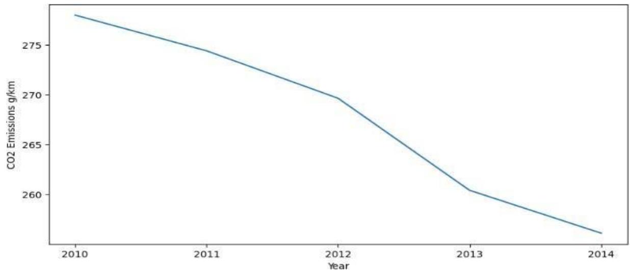 Figure 12: Line Graph to Show Trend Between Year 2020 and 2014
The plot shows downward trend which support various governmental policies in reducing emission and greenhouse effect.
The next visual analysis is setting up heat map to show interaction between our dataset attributes.
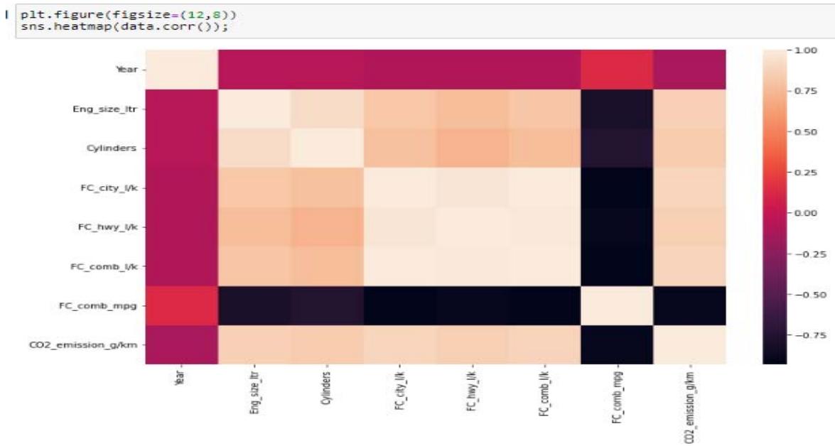 Figure 13: Heatmap Showing Correlation Among Variables
It was observed from the heat map that there is high positive correlation between fuel consumptions, engine size and cylinders with C02. Thus, we extend our visualization to plotting of fuel types with C02.
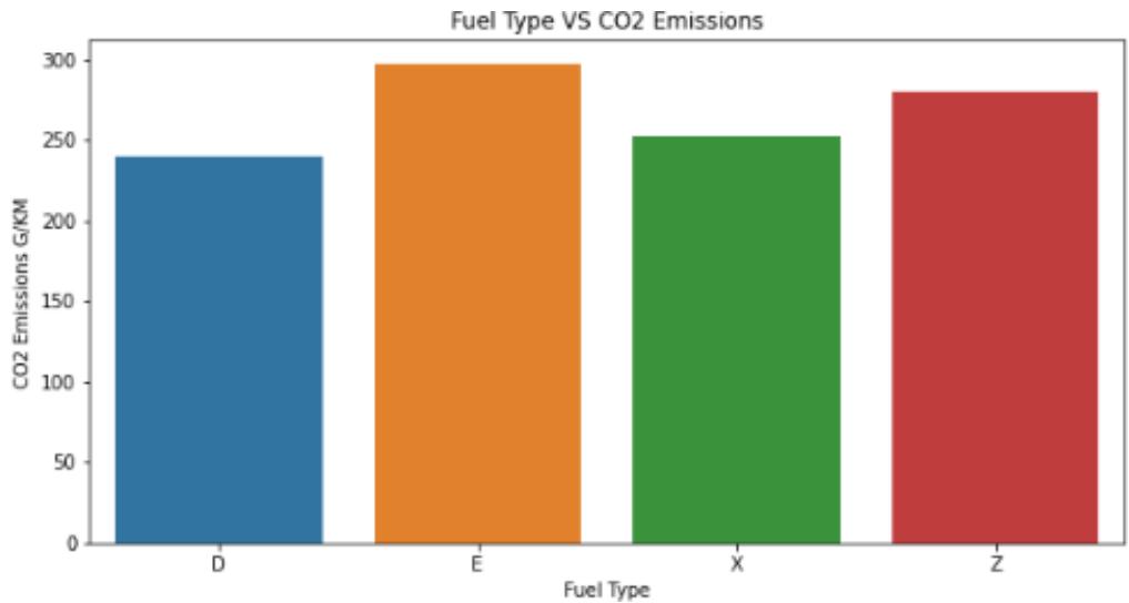 Figure 14: Bar Plot of C02 Emission Against Fuel Type
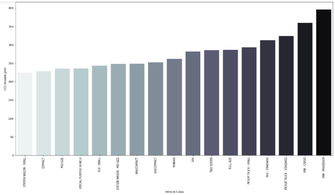
The plot showed that fuel type E and Z yields more C02 emission during the period under study. In a similar manner we plotted vehicle class based on fuel consumption against C02 emission using seaborn library. The graph showed that Van passenger and Van cargo yielded highest number of C02 emission between 2010 to 2014. We can also infer that weight of the vehicle has determining effect on C02 emission. The bigger vehicles are seen towards the right with high value of emission. This supports proposal by Pagerit et al, 2006, Wohlecker et al 2007 and Bishop et al 2014 as mentioned in our introduction.
 Figure 15: Bar Plot of Vehicle Class With Fuel Consumption Against C02 Emission
Moving forward, we produced another visual that display which of the vehicle make produced most emission.
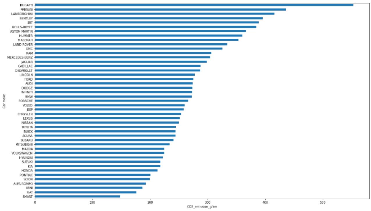 Figure 16: Bar Plot of Vehicle Make Against C02 Emission
The graph (Fig. 16) shows that Bugatti lead in term of amount of C02 emission produced into the environment. Bugatti uses fuel type Z with more controlling impact CO2 emission as shown in Fig. 14 above. As identified by our heat map, interaction between engine size C02 emission is plotted using scatter plot through seaborn.
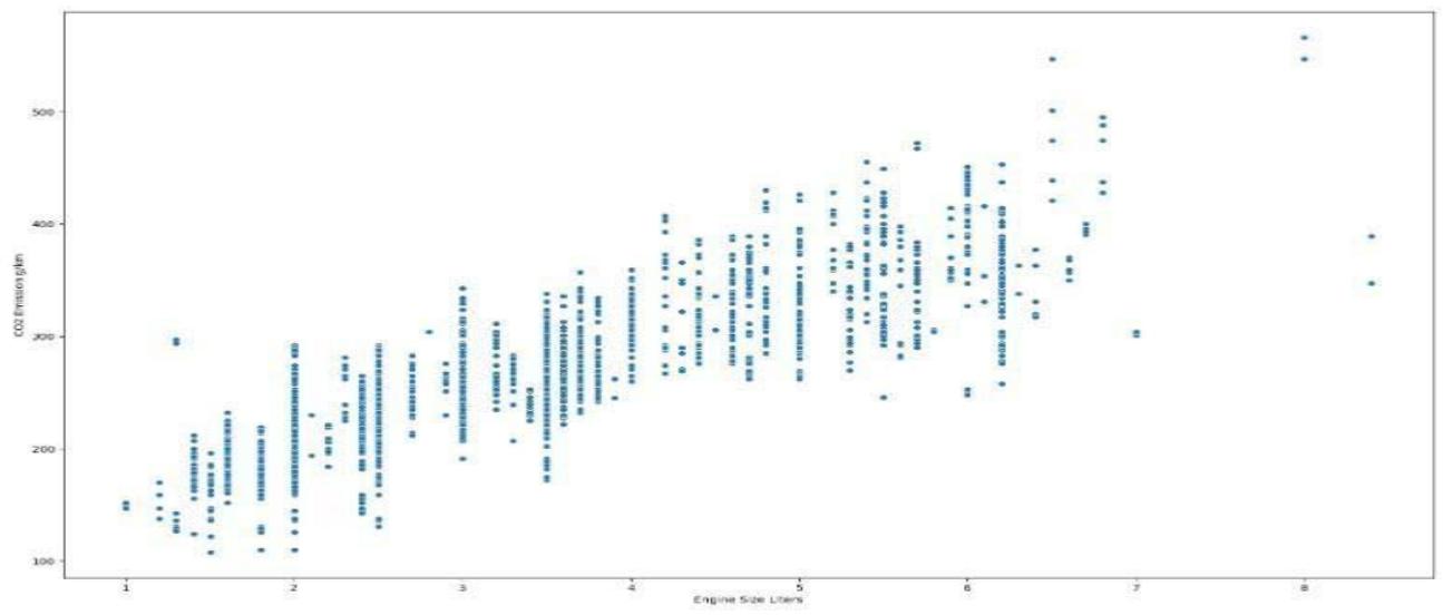 Figure 17: Scatter Plot C02 emission against Engine size
From the display, there is a strong direct proportional relationship between the two variables. The bigger the engine size the higher the C02 emission.
## V. DISCUSSION
Analysis performed on the dataset will validate emission models as generated by the various attributes. The dataset contains 5359 records with 12 attributes and as such it is hard to see information the raw figures is speaking to. Representing the data on various visual plots allow us to see hidden information at ease. Ben and Rachel 2015, used applicable visualization techniques like column chart, pie chart, line plot to analyze fuel consumption data. Similarly, Bielaczyc, Szczotka and Woodburn 2019 used column chart to represent fuel type plot against C02 emission and contour map to display emission in certain locations with vehicle load and speed.
The application of bar charts (Fig.15 & 16) in our analysis has easily been achieved because of its robustness in representing categorical data, perhaps Cleveland's dot plot would have taken fewer spaces with improved aesthetic for plot like fuel type vs C02 emission. For simplicity each dot will be represented as $40\mathrm{g / km}$ of emission. Dot plot uses minimum ink to optimum effect and still deliver excellent design (Tutte, 1983. Dave, Jaap and Ian, 2005).
Heat map has been widely used in many visualizations analysis due to its intuitive approach of colouring and ability to present interaction among variables in a single diagram. In work such as ours, we could have introduced our heat map after plotting table lens graphs. As asserted by Sinar 2015, table lens has a very high efficiency in yielding many interactions in a single plot while serving as starter in dataset visualization. Also, in addition to our heatmap, facet (Trellis) plots can be used to create additional interactions (sub-plots) for variables showing strong correlation from the map.
## VI. CONCLUSION
Data visualization has gained great popularity with advancement of software technology and variety of platforms. One of the popular platforms to create visualization is Jupyter notebook where cells for codes and visual displays are available on the interface. We have used data visualization to investigate controlling effects of fuel consumption on C02 emission. Variety of techniques such as line chart, bar chart, heat maps and scatter plot were used to analyze the field data in order to create informative patterns on level of influence of various variables on C02 emission. Our visual analysis revealed resultant effects of important variables that need to be curtailed to minimize C02 emission in the environment. This kind of study will assist policy makers to find effective solutions to climatic changes caused by vehicle movements.
In as much as we have efficient visuals which produced graphical display of raw data., there are few exceptions. The exceptions were critically reviewed to create room for improvement. The improvement will yield visual that create more robust outcomes where concentrated interactions are revealed in our visuals and nicer aesthetic.
Generating HTML Viewer...
References
6 Cites in Article
Heidrun Schumann,Wolfgang Müller (2000). Visualisierung von Strömungsdaten.
P Spencer,S Emil (2018). A notebook format for the holistic design of embedded systems (Tool Paper).
E Tufte (1983). The visual display of quantitative information.
Useap (2022). Greenhouse Gas Emissions from a typical passenger vehicle. Greenhouse Gas Emissions from a Typical Passenger Vehicle | US EPA.
Roland Wohlecker,Martin Johannaber,Markus Espig (2007). Determination of Weight Elasticity of Fuel Economy for ICE, Hybrid and Fuel Cell Vehicles.
C Xi,C Xinyu (2021). Data Visualization in Smart Grid and Low-Carbon energy systems: A review.
No ethics committee approval was required for this article type.
Data Availability
Not applicable for this article.
How to Cite This Article
Tewogbade Shakir. 2026. \u201cAnalysis and Visualization of Fuel Consumption Against Co2 Emission\u201d. Global Journal of Science Frontier Research - H: Environment & Environmental geology GJSFR-H Volume 23 (GJSFR Volume 23 Issue H6): .
Explore published articles in an immersive Augmented Reality environment. Our platform converts research papers into interactive 3D books, allowing readers to view and interact with content using AR and VR compatible devices.
Your published article is automatically converted into a realistic 3D book. Flip through pages and read research papers in a more engaging and interactive format.
CO2 emission has an adverse effect on the environment and cause greenhouse effect with significant negative climatic changes. This subsequently lead global warming which hurts both human and crops. It is important for us to perform visual analysis with available dataset using Canada as a case study.
Our website is actively being updated, and changes may occur frequently. Please clear your browser cache if needed. For feedback or error reporting, please email [email protected]
Thank you for connecting with us. We will respond to you shortly.